Typography is the art and technique of arranging type to make written language legible, readable, and appealing when displayed. It involves the selection of typefaces, point sizes, line lengths, line-spacing, and letter-spacing, among other elements.
The art of typography has been around since the invention of printing press in the 15th century. Since then, it has evolved into a complex and sophisticated discipline that plays a crucial role in design and communication.
Good typography can enhance the readability and visual appeal of a text, while poor typography can make it difficult to read and unattractive. Therefore, it is important to understand the principles of typography and how to use them effectively.
In this article, we will explore the beauty of typography and its various aspects. We will discuss the history of typography, the different types of typefaces, the anatomy of letters, and the rules and guidelines of typography. By the end of this article, you will have a deeper appreciation for the art of typography and the important role it plays in design and communication.
In the world of design, typography is an essential element that can make or break a project. Typography refers to the art of arranging text in a way that makes it readable, legible, and appealing to the viewer. It involves selecting the right typeface, font size, spacing, and color to create a visually appealing design. In this blog post, we will discuss the importance of typography in design and explore how it can be used to enhance a design.
Enhancing Design with Typography
Typography plays a significant role in enhancing the visual appeal of a design. It can be used to convey emotions, set the tone of a message, and establish a hierarchy of information. For example, a bold and thick typeface can be used to convey power and strength, while a thin and delicate font can create a sense of elegance and sophistication.
Typography can also be used to establish a visual hierarchy of information. By adjusting the size, weight, and spacing of the text, designers can guide the viewer’s eye to the most important information first. This can be especially helpful in designs that contain a lot of information, such as infographics or annual reports.
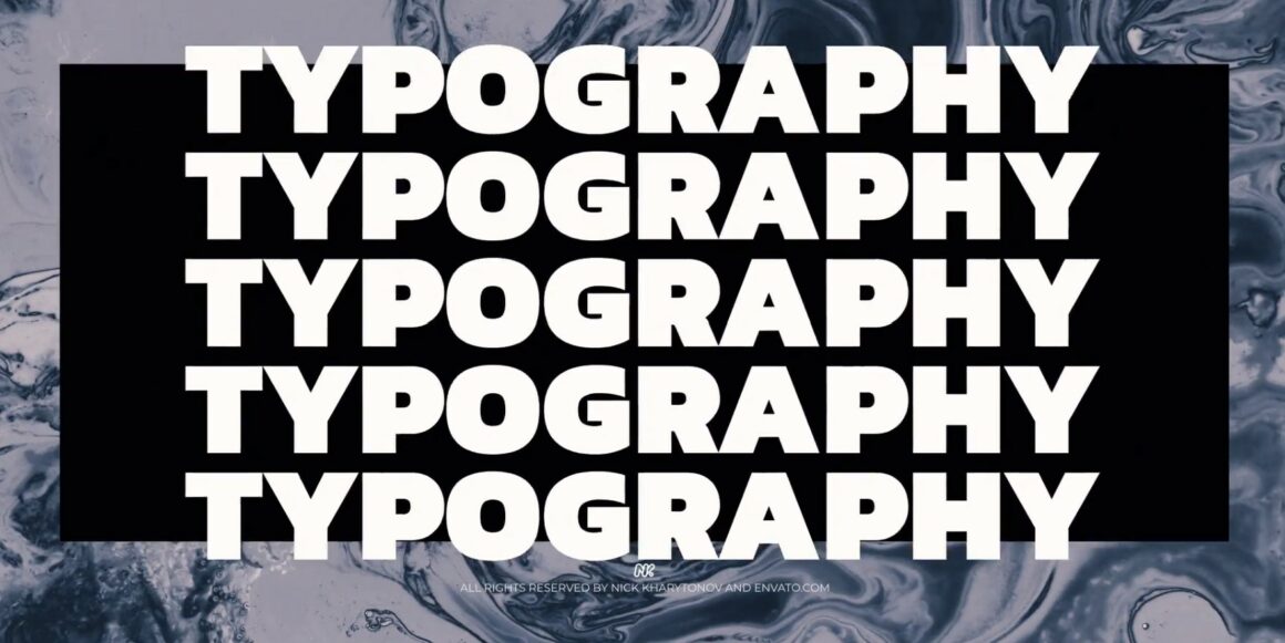
Examples of Typography in Design
One excellent example of typography in design is the iconic Coca-Cola logo. The flowing script font, known as Spencerian script, has become synonymous with the brand and is instantly recognizable. The font’s elegant curves and loops convey a sense of nostalgia and tradition, while the bright red color creates a sense of energy and excitement.
Another example is the website design for Airbnb. The typography on the website is clean, modern, and easy to read. The designers used a sans-serif font for the headings and a serif font for the body text, creating a visual hierarchy that guides the viewer’s eye. The font sizes and spacing are also carefully considered, making the website easy to navigate and aesthetically pleasing.
Tips for using typography in design
Now that you understand the importance of typography in design, here are some tips to help you use typography effectively in your projects:

1. Choose the right typeface
When selecting a typeface for your project, it is important to consider the style and message you want to convey. The typeface you choose should complement the overall design and serve as a subtle yet effective tool for communicating your message. For instance, if you are designing a logo for a law firm, you may opt for a serif font that conveys a sense of tradition, professionalism, and authority. A serif typeface can help to establish a sense of credibility and trustworthiness, which are important qualities for a law firm. In contrast, if you are designing a logo for a modern, tech-focused company, you may want to choose a sans-serif typeface that conveys a sense of innovation and forward-thinking. Ultimately, the typeface you choose can have a significant impact on the overall success of your project, so it is important to choose wisely and consider all possible options.
2. Pay attention to font size and spacing
Font size and spacing are critical to ensuring that your text is easy to read and understand. When it comes to font size, it’s important to find the right balance. Fonts that are too small can strain the eyes, while fonts that are too large can make it difficult to fit enough text on a page. Aim for a font size that is easy to read without being too large.
In terms of spacing, it’s important to give your text room to breathe. Tight spacing can make it difficult for readers to distinguish between lines and can cause them to lose their place. On the other hand, spacing that is too loose can make your text look disjointed and can make it harder to follow. Aim for a spacing that strikes a balance between readability and cohesiveness, and make sure to test your text on different devices to ensure that it is legible across a range of screen sizes.
3. Use typography to establish a hierarchy of information
As previously discussed, typography plays an integral role in establishing a visual hierarchy of information. Utilizing various font sizes, weights, and styles can effectively guide the viewer’s eye to the most important information first. In addition to the aforementioned techniques, typography can also incorporate the use of color, spacing, and texture to further enhance its ability to convey meaning and evoke emotion. By thoughtfully selecting and strategically implementing these various elements, designers can create a cohesive and impactful visual narrative that effectively communicates the intended message to the viewer.
4. Experiment with color
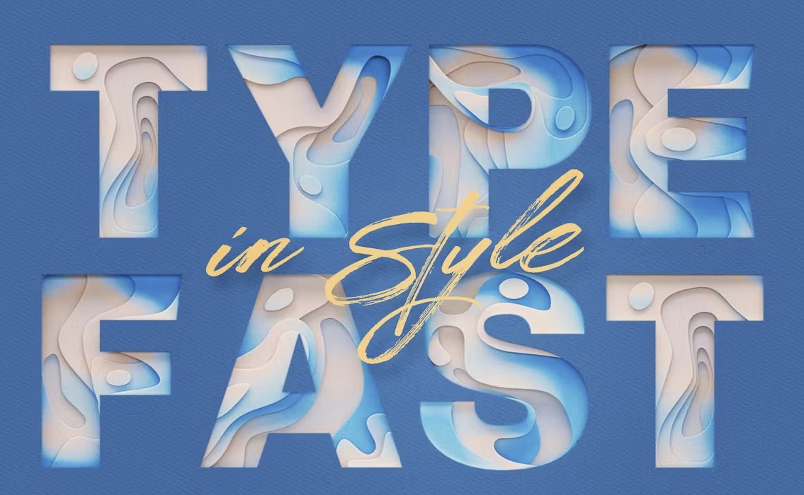
Color can be a valuable tool in enhancing the visual impact of your typography. In addition to choosing colors that complement your project’s overall style and message, you can also consider using contrasting colors to highlight certain elements or create a specific mood. For example, warm colors like red and orange can convey energy and excitement, while cool colors like blue and green can suggest calm and relaxation. Additionally, you can experiment with different hues and shades to create a more complex and nuanced color palette that adds depth and interest to your design. By taking the time to carefully consider your use of color, you can elevate your typography and make it more engaging and memorable for your audience.
Final Thoughts
Typography is an essential element of design that can greatly enhance the visual appeal of a project. By selecting the right typeface, font size, spacing, and color, designers can create a design that not only looks good but also effectively communicates a message. Whether you’re designing a logo, website, or infographic, typography plays a critical role in establishing a brand identity and communicating a message. So next time you work on a design project, remember the power of typography and how it can take your design to the next level.
Related posts:

