With the increasing number of people accessing websites through a wide range of devices such as smartphones, tablets, and laptops, web designers and developers have to adjust their website designs to ensure that users have an optimal experience regardless of the screen size. Making Typography Look Good, as a critical component of website design, plays a significant role in determining the readability, accessibility, and overall aesthetic appeal of a website. Through this guide, we will delve into the latest trends and best practices for optimizing typography to ensure that text looks good on any screen in 2023. We will explore various aspects of typography, including font selection, font size, line spacing, and contrast.
Understanding Typography Sizing and Scales
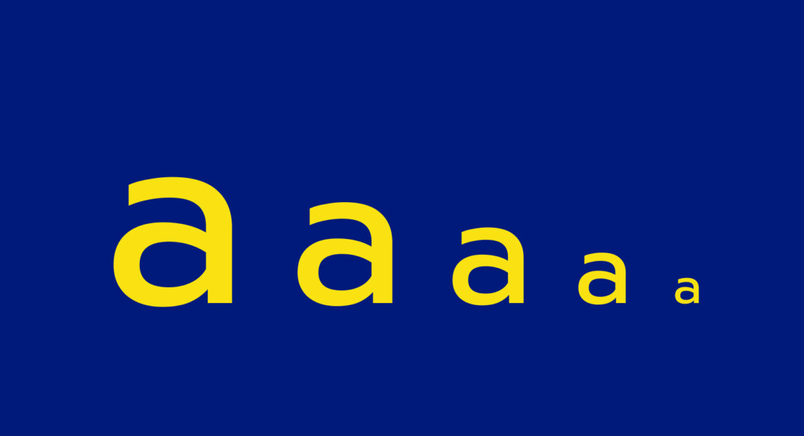
Typography sizing is the size of text on a webpage, while typography scales are different sizes of text used in a design. A responsive typography scale is a set of font sizes that adjust to different screen sizes and devices. The goal is to make text readable and legible on any device, while maintaining a consistent visual hierarchy.
Text size on a webpage is important for readability and accessibility. If the text is too small, users may struggle to read it, while if it is too large, it may look unprofessional and cluttered. To make sure text is legible on any screen, designers and developers should use relative units like em or rem instead of fixed pixel values. This lets font sizes adjust proportionally to different screen sizes, making typography more flexible.
Typography scales are the different font sizes used in a design. A responsive typography scale is important for making text look good on any screen, as it adjusts font sizes to different devices and screen sizes. This ensures that typography is readable and legible on any device, while also maintaining a consistent visual hierarchy. With a modular scale, designers can make sure their typography is consistent across different devices and screen sizes.
Best Practices for Responsive Typography Sizing and Scales
To create an effective responsive typography scale, designers and developers should follow these best practices:
Use relative units
As mentioned earlier, using relative units such as em or rem is critical for ensuring that font sizes adjust proportionally to different screen sizes. This allows typography to be more flexible, allowing it to adapt to different screen sizes and resolutions.
Establish a baseline font size
Choosing a baseline font size that is legible on small screens is crucial, as it ensures that the typography is readable on all devices. Designers and developers should gradually increase font sizes for larger screens, while still maintaining a consistent visual hierarchy.
Use a modular scale
A modular scale is a set of font sizes that are based on a consistent ratio. This creates a harmonious and balanced typography scale that is visually appealing. By using a modular scale, designers can ensure that their typography is consistent across different devices and screen sizes.
Consider line height
Line height refers to the amount of space between lines of text. Using an appropriate line height for the font size ensures readability, as it prevents the text from appearing cluttered or cramped. A good rule of thumb is to use a line height that is 1.5 times the font size.
Test on multiple devices
Testing the typography scale on a variety of devices is crucial for ensuring that it is legible and visually appealing on different screens. This ensures that the typography is flexible enough to adapt to different devices and screen sizes.
The Future of Responsive Typography Sizing and Scales
As technology continues to advance, the future of responsive typography sizing and scales will likely involve more advanced techniques such as variable fonts and artificial intelligence. Variable fonts allow designers to create fonts with multiple variations within a single file, which can adjust to different screen sizes and resolutions. This allows designers to create more flexible and adaptable typography. Artificial intelligence can analyze user behavior and preferences to adjust typography sizing and scales in real-time, creating a truly personalized user experience.
Conclusion for Making Typography Look Good
Making Typography Look Good and Responsive typography sizing and scales are essential for creating readable and visually appealing websites in 2023. By following best practices and staying up-to-date with the latest trends and technologies, designers and developers can create effective typography scales that adjust to any device or screen size. As technology continues to evolve, the future of responsive typography is sure to bring even more exciting possibilities for web design and development.
In conclusion, responsive typography is a vital aspect of web design that cannot be overlooked. By using a modular scale, relative units, and considering line height, designers can create typography that is both readable and visually appealing on any device. As technology continues to advance, the future of responsive typography is sure to bring even more exciting possibilities for web design and development. By implementing the best practices outlined in this guide and staying up-to-date with the latest trends and technologies, designers and developers can ensure that their websites look good on any screen and provide users with a great experience.

