Using the right colors is important for your design project. Colors can trigger emotions, create a tone, and convey a message. That’s why it is crucial to choose the right color palette for your design project. In this blog post, we will explain color theory and give you some advice on how to choose colors for your next design project.

Understanding Color Theory
Color theory is a set of rules and guidelines that designers use to choose the right colors and create designs that look good. To do this, designers use a color wheel based on how people see colors, what they mean, and what looks good together. The goal of color theory is to create pleasing color combinations that evoke certain feelings.
To create harmonious color combinations, color theory uses principles. There are three primary colors: red, blue, and yellow, which are mixed to create all other colors. The secondary colors are green, orange, and purple, which are created by mixing two primary colors. Tertiary colors are made by mixing a primary and a secondary color.

Color Theory Made Simple
Color theory was established by Sir Isaac Newton in 1666 when he invented the color wheel. Newton saw colors as the way humans perceive different wavelengths of light, rather than absolute qualities. He categorized colors into three groups:
- Primary (red, blue, yellow)
- Secondary (mixes of primary colors)
- Tertiary (mixes of primary and secondary colors)
Newton’s findings about color led to further study of its properties in fields ranging from art to astronomy. A color’s properties include:
- Hue – how it appears (e.g. “is green”)
- Chroma – how pure it is: whether it has shades (black added), tints (white added), or tones (grey added)
- Lighting – how pale or saturated it appears

Use Color Schemes and Color Temperatures for Design Harmony
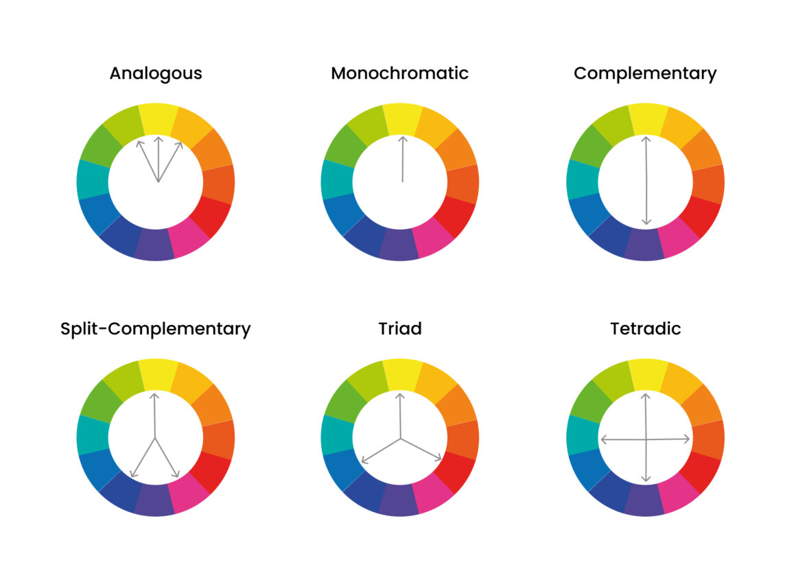
When designing screens, designers use the additive color model with red, green, and blue as primary colors. Choose colors that create attractive interfaces and are easy for users to navigate. Consider any of these main color schemes when beginning your design process:
- Monochromatic – Use one hue and create other elements from different shades and tints of it.
- Analogous – Use three colors located beside one another on the color wheel. A variant is to mix white with these to form a “high-key” analogous color scheme.
- Complementary – Use “opposite color” pairs to maximize contrast.
- Split-Complementary (or Compound Harmony) – Add colors from either side of your complementary color pair to soften contrast.
- Triadic – Take three colors which are equally distant on the color wheel. These colors may not be vibrant, but the scheme can be as it maintains harmony and high contrast.
- Tetradic – Take four colors that are two sets of complementary pairs and choose one dominant color. This allows rich, interesting designs. However, watch the balance between warm and cool colors.
- Square – You find four colors evenly spaced on the color wheel. Square schemes can work well if you use all four colors evenly.
Use color to reflect your design’s goal and brand personality. Also, consider how color theory can positively affect users. Carefully choose the color temperature (warm, neutral, or cool) to convey your message. For instance, you can make a neutral color like gray warm or cool based on your organization’s personality and industry.
Applying Color Theory to Your Design Project
Picking the right colors is crucial for good design. Combinations of colors that are pleasing to the eye make the design feel smooth and user-friendly. However, if the colors don’t match, the design can feel unpleasant and difficult to use. Therefore, it’s essential to learn how to choose color combinations that people will enjoy.
After learning about color theory and how to choose colors, it’s time to use that knowledge in your design. First, choose a main color that represents the mood and emotions you want to show. Then, pick secondary and tertiary colors that go well with the main color and make a balanced color set.
When designing, think about how colors look together and how they balance. Use color theory to create a design that looks good and is easy to look at.
Use Color Theory to Match What Your Users Want to See
Having the right contrast is important to get users’ attention. If your design is too plain, users might just scroll past it. So, choose colors that are vibrant and exciting. But, remember that the vibrancy you choose can also trigger the desired emotional responses from users. For example, if you’re making a website for a toy store for kids, pick bright colors that can make them feel excited and happy. On the other hand, if you’re designing a website for a law firm, use muted colors to make it look professional and trustworthy.
When choosing colors for a website, it’s important to think about who the website is for. Different people react differently to colors based on their gender, age, experience, and culture. For example, if the website is for an older audience, it’s best to use colors that aren’t too bright and are easy to look at. If the audience is multicultural, choose colors that are generally liked across many cultures.
When making designs, it’s important to ensure that they are accessible to everyone, including people who are colorblind. This can be achieved by conducting UX research and selecting colors that work well for all users. Remember that people from different regions have different expectations for how designs in certain industries should look. For example, blue is commonly used in banking in the West and is generally well-liked. However, it can also have positive associations in other cultures. It’s important to note that some colors can have different meanings in different countries. For instance, red can represent good luck in China, mourning in South Africa, and danger or sexiness in the USA.
Consider your users when choosing colors for your design. You want them to feel comfortable and excited to use your product or service. Test your color choices to make sure they have the desired effect.
Choosing Colors for Your Project
Choosing colors for your project involves considering the emotions and meanings that different colors convey. Red is associated with passion and energy, while blue is associated with calmness and professionalism. Additionally, you should keep in mind color contrast and balance. A high-contrast color scheme can make your design stand out, while a low-contrast scheme can create a subtle and sophisticated look.
Another important thing to think about is the colors you use. Analogous color palettes use colors that are next to each other on the color wheel, like blue and green. Complementary color palettes use colors that are opposite each other on the color wheel, like blue and orange. Triadic color palettes use three colors that are evenly spaced on the color wheel, like red, yellow, and blue.
How to Use Color Psychology and Meaning to Influence Emotions
Color psychology is a really interesting area of study that looks at how colors can affect how people feel and act. Different colors are often associated with specific feelings or ideas. If you want to create a good design, it’s important to know about color meanings and how they can make your users feel a certain way.
Color psychology is useful in many industries, especially marketing and design. Choosing the right colors can persuade people to take action, like buying products or signing up for mailing lists. In other words, knowing about color theory can increase your conversion rate.
Red
Red is a strong color that can represent many feelings and ideas, both positive and negative. It’s often linked to love and passion, but can also mean danger or anger. Using red can be a good way to quickly get people’s attention. That’s why many food and drink companies use red to make people feel more hungry and eager.
Orange
Orange is a happy, friendly, and motivating color. A website with a bold orange background for its navigation screen can give off a creative and adventurous vibe. Using orange as the main color on your website can make it easy for visitors to remember and give them a good first impression.
Yellow
Yellow is a warm color that represents happiness and sunlight. Using it on your website can add confidence and inspiration to your design.
Green
Green is a pleasant and relaxing color that people commonly associate with nature, the environment, and rejuvenation. It’s frequently used by eco-conscious brands because of its upbeat and invigorating appearance.
Blue
Blue is a favorite color for company brands because it symbolizes trust and dependability. When it’s deeply colored, it gives a refreshing and calming impression. However, if it’s too light, it can look cold and sad.
Purple
Purple is a fancy and special color that has always been linked with kings and money. It can show strength and honesty because it uses the energy of red and blue. It can also make people feel calm, like they are dreaming. But, too much purple can be too much for users.
Pink
Pink is a color that is youthful and romantic. It makes people think of love that never ends. Pink is linked to being sensitive and feminine, and it can make a strong statement. However, using a lot of pink requires confidence, but if you use it well, it can make designs that are impressive and easy to remember.
Black
Black can have various meanings and evoke different feelings when combined with other colors. In Western cultures, it is sometimes associated with evil and death, while in the East, it symbolizes strength and wisdom. Black can be sad and mysterious, or serious and modern. It is a great color for website backgrounds as it creates a sharp contrast with lighter typography.
White
White is widely used in modern and minimalist website design because it enhances readability and complements any color. The white space creates a sense of cleanliness and lightness. It can spark new ideas by reminding users of a blank page. However, too much white can make the website look empty and isolated.
Tools and Resources for Choosing Colors
Picking good colors for your design work can be hard. But don’t worry, there are many tools and resources you can use. Here are some we like:
- Adobe Color – This is a free online tool that allows you to create custom color palettes and explore different color schemes.
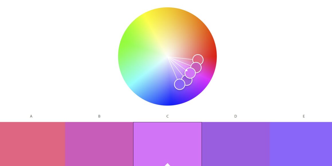
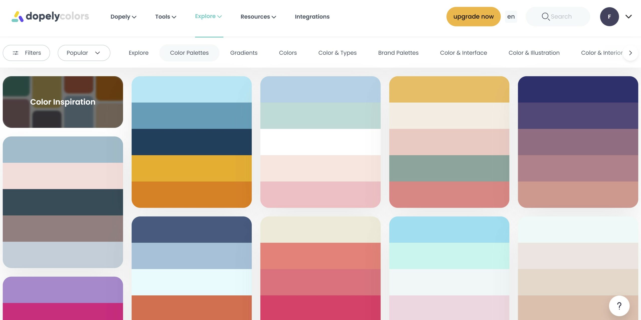
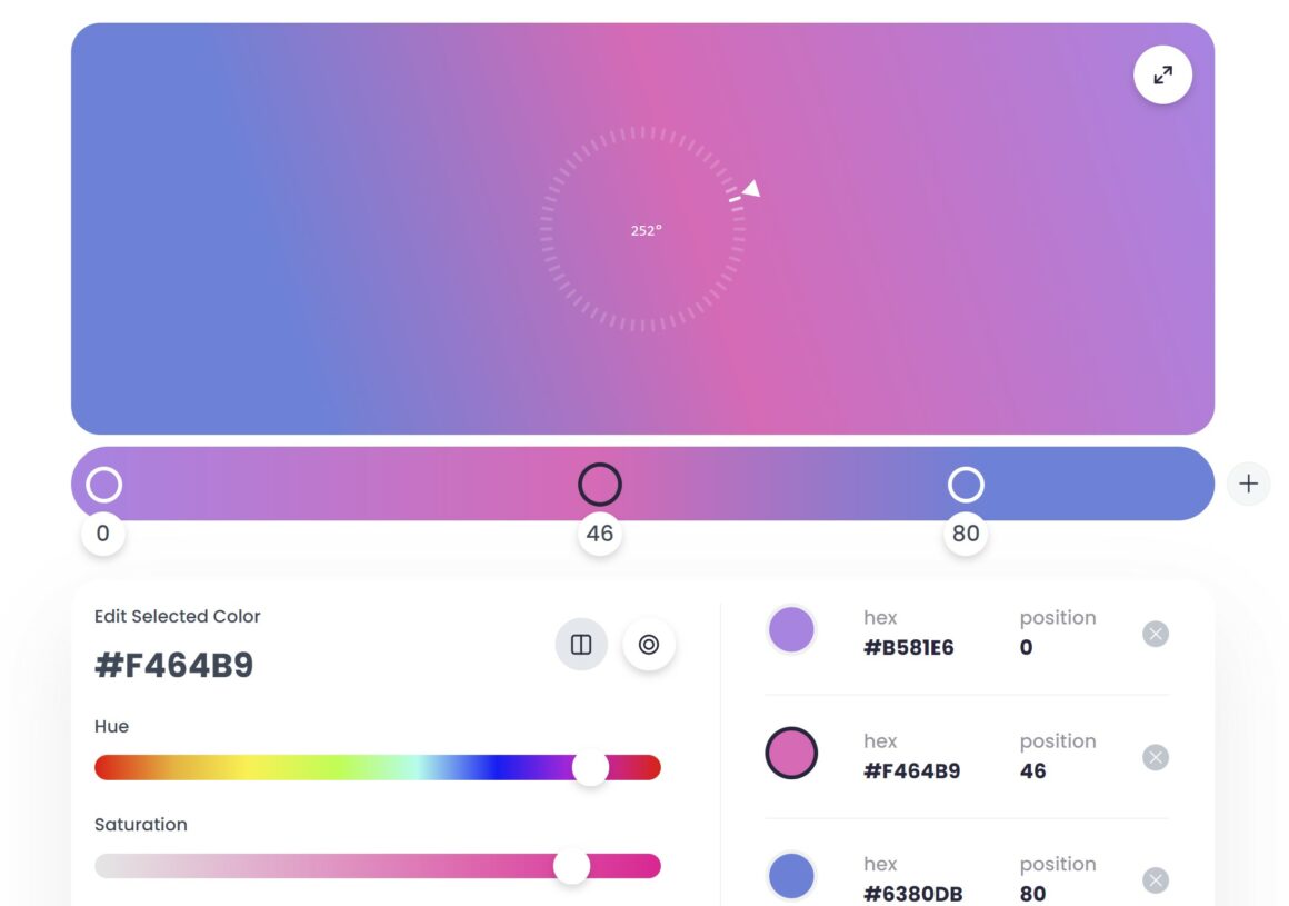
- DopelyColors – This is another free online tool that generates color schemes based on your color choices. It also has a feature that allows you to preview how the colors will look on a website.
- Colourlovers – This is a community-driven website that offers a vast collection of color palettes and patterns.
- Pantone – This is a color-matching system used in the printing industry. It provides standardized colors that can be reproduced accurately.
- Dribbble – This is a social media platform for designers. You can browse other designers’ work and see how they use color in their designs.

Best Practices for Using Colors in Your Design
In addition to understanding color theory and using tools to choose colors, there are some best practices you should follow when using colors in your design. These include:
- Limit your color palette – Using too many colors can be overwhelming and distracting. Stick to a limited color palette to create a cohesive and balanced design.
- Use colors consistently – Consistency is key in design. Use the same colors throughout your design to create a sense of unity and harmony.
- Consider accessibility – Make sure your color choices are accessible to all users, including those with color vision deficiencies. Use tools like WebAIM’s Contrast Checker to ensure your color contrast meets accessibility standards.
- Test your colors – Before finalizing your design, test your colors on different devices and in different lighting conditions to ensure they look the way you intended.
Things to Remember
Color psychology can be complex to understand and learn, but it can help designers understand users and their needs. Here are some important points to remember:
- Choose colors carefully since they can influence users deeply.
- Ensure your design and its colors convey the intended message and tone.
- Get to know your target audience since color preferences and meanings depend on age, gender, and culture.
- Colors may appear differently on different devices, so testing is always a good idea.
- Consider testing UI colors with representatives of the target audience.
- Create color combinations that are easy for users to see and understand.
Conclusion
Colors are a powerful tool in design. By understanding color theory, using tools to choose colors, and following best practices, you can create visually appealing and effective designs. Remember to consider the emotions and meanings associated with each color, as well as the color contrast and balance. With these tips and resources, you can confidently choose colors for your next design project.
Choosing the right color palette is an important step in any design project. By understanding color theory and applying it to your design, you can create a visually appealing and harmonious design. Remember to consider the emotions and meanings associated with each color, as well as the color contrast and balance. With these tips, you can confidently choose colors for your next design project.

