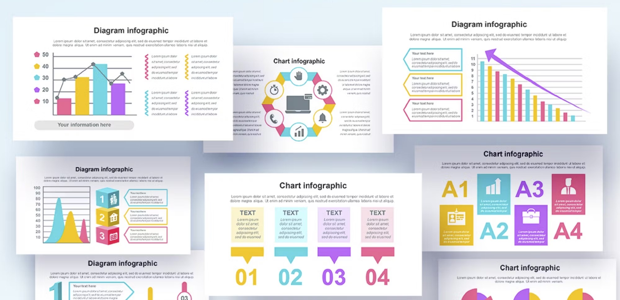
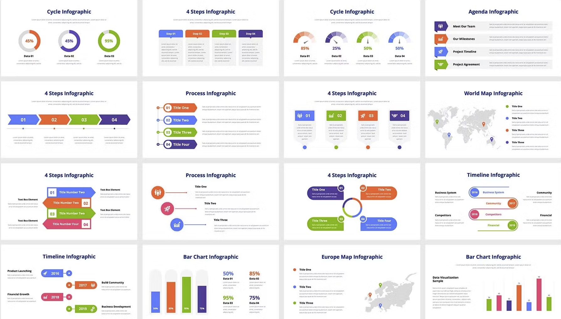
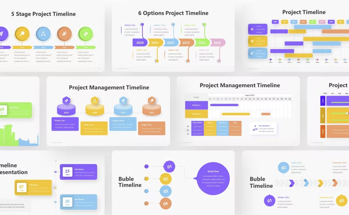
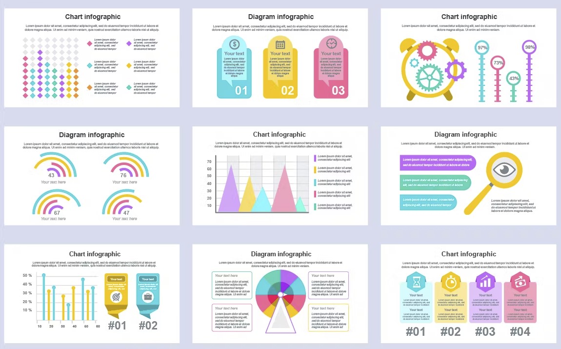
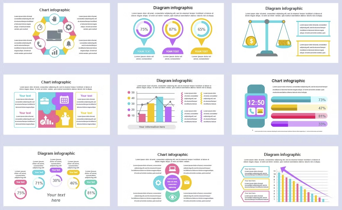
Infographics have become a popular way to present complex information in a visually appealing way. They allow you to tell a story through data visualization, making it easier for people to understand and retain information. However, creating effective infographics can be a challenge. In this post, we will provide guidance on how to create infographics that effectively communicate your message.
Before we continue, you may like this post to:
The Importance of Data
The foundation of any good infographic is data. Without good data, an infographic will not be effective. Before you start creating your infographic, make sure you have good data that is accurate, up-to-date, and relevant to your audience. Once you have good data, you can start thinking about how to visualize it.
Keep It Simple
When it comes to creating infographics, less is often more. A cluttered infographic can be overwhelming and difficult to read. Keep your design simple and avoid using too many colors or fonts. Use visuals to break up text and make the information easier to digest. Use white space to create a clean and uncluttered design.
Storytelling
Infographics should tell a story. Your data should support a clear and compelling narrative. Start by identifying the main message you want to convey and then use your data to support that message. Use headlines, subheadings, and captions to guide the reader through your infographic and help them understand the story you are telling.
Visualize Your Data
Once you have good data, it’s time to think about how to visualize it. A good visualization can help you communicate complex information in a simple and easy-to-understand way. Here are some tips for visualizing your data:
Choose the Right Type of Chart
When it comes to visualizing data, there are a variety of chart types one can utilize in order to effectively convey the information. Some of the most common chart types include bar charts, line charts, and pie charts. However, depending on the nature of the data being presented, there may be other chart types that better suit the task at hand. For instance, scatterplots are particularly useful when examining the relationship between two variables. Similarly, heat maps can be helpful when attempting to identify patterns in large datasets. Ultimately, the key is to select the chart type that most accurately represents your data and allows for ease of interpretation by your intended audience.
Use Color Effectively
Color can be a powerful tool in design as it has the ability to evoke emotions and help highlight important information. Choosing the right color palette can make your infographic visually appealing and help guide the reader through the content. It is important to keep in mind that using too many colors can have the opposite effect and make your design look cluttered and confusing. Therefore, it is crucial to select a color palette that complements your brand and the message you want to convey. Consider using different shades of the same color or colors that are commonly associated with your brand to create a cohesive and professional look. Additionally, you can use color to create contrast and draw attention to key elements in your infographic. By using color strategically, you can enhance the overall effectiveness of your design and make it more engaging for your audience.
Use Icons and Illustrations
Icons and illustrations are an excellent way to make your infographic more engaging and visually appealing. They can help to draw the viewer’s attention to the most important information and make the content more memorable. By using icons and illustrations strategically, you can create a more cohesive design and make the information easier to understand. In addition, using a variety of visual elements can help to break up long blocks of text and prevent the viewer from becoming overwhelmed. When choosing icons and illustrations, it’s important to select images that are relevant to the topic and consistent with the overall design aesthetic. Remember to use them sparingly, however, so as not to overwhelm the viewer or detract from the main content of the infographic.
Design Your Infographic
Once you have visualized your data, it’s time to start designing your infographic. Your infographic should be carefully thought out, and every element should have a purpose. Here are some tips for designing an effective infographic:
Firstly, you should decide on the story that you want to tell and the key message that you want to convey. This will help you to decide what data to include and how to present it.
Secondly, you should choose a color scheme that is appropriate for your message and your audience. Colors can help to convey emotion, and they can also be used to group related data.
Thirdly, you should consider the layout of your infographic. You should aim to make your infographic easy to read and understand, and you should use visual hierarchy to guide the reader through the information.
Finally, you should consider the typography of your infographic. You should choose fonts that are easy to read, and you should use them consistently throughout your design. You can also use typography to help convey your message and to add visual interest to your design.
Organize Your Information
When it comes to creating an infographic, it is important to organize your information in a way that is easy to follow. One way to do this is by using headings, subheadings, and captions to break up the text and help guide the reader through each section.
Headings and subheadings are particularly useful for providing structure to your infographic. They allow you to separate your information into different categories or topics, which can help the reader understand the overall message you are trying to convey. Captions are also important, as they provide additional context and can help to explain any images or charts you use in your infographic.
In addition to breaking up your text, you may also want to consider adding additional information or examples to help support your key ideas. This can help to make your infographic more engaging and informative, and can help to keep the reader interested throughout.
Overall, when creating an infographic, it is important to keep the reader in mind at all times. By organizing your information in a logical way and providing additional context and examples where necessary, you can create an infographic that is not only visually appealing, but also informative and easy to follow.
Keep It Simple
As previously noted, when it comes to designing infographics, a minimalist approach is often more effective. However, this does not mean that your design should be devoid of creativity or personality. In fact, you can still add visual interest to your infographic while keeping the overall design simple and uncluttered. One way to achieve this is by using a consistent color scheme throughout the design, which can help tie together different elements and create a cohesive look. You can also experiment with different font styles and sizes to add variety and emphasize key points. Finally, don’t be afraid to use white space strategically to create a sense of balance and guide the viewer’s eye through the design.
Use a Grid
Using a grid can be incredibly helpful when it comes to creating a visually appealing design. By using a grid, you can not only create a balanced layout, but also ensure that your text and visuals are properly aligned for a more professional look.
Furthermore, grids can be customized to fit the specific needs of your project. By adjusting the size and spacing of the grid, you can create a design that is perfectly tailored to your content. Additionally, using a grid can help you to organize and structure your content more effectively, making it easier for your audience to follow along.
Overall, incorporating a grid into your design process can greatly enhance the overall quality and effectiveness of your work. By utilizing this tool, you can create a design that is both aesthetically pleasing and easy to understand, ensuring that your message is conveyed clearly and effectively.
Conclusion
Creating an effective infographic takes time and effort, but it can be a powerful tool for communicating complex information in a simple and easy-to-understand way. By following these tips, you can create infographics that effectively communicate your message and engage your audience. Remember to start with good data, keep it simple, and tell a story through data visualization.

