30 Sample of Helvetica Font used in Giant Brands: The fonts you choose for both your content and logo portray who you are as a brand. This is why big brands are careful and extremely particular about the fonts they choose.
While many would expect such big brands to set about creating their customized typography given the resources that are at their disposal (some brands like Yahoo! and Heineken have opted for this), a majority of these brands prefer using an existing font and modify it to suit their taste and vision. Soon enough, the font gets associated with the brand in no time.
One of the most ubiquitous fonts that famous brands use is the Helvetica font. Formerly known as Die Neue Haas Grotesk, Helvetica is a sans-serif typeface which was developed by Max Miedinger, a Swiss typeface designer with contribution from Eduard Hoffman in 1957. It was created at the Hass type foundry (known as Haas’sche Schriftgiesserei) of Münchenstein, Switzerland.
Haas’sche Schriftgiessrei was controlled by Stempel, a type foundry that was also in the control of Linotype. Helvetica was based meticulously on Schelter-Grotesk and created as a neutral typeface with no specific meaning in itself. The idea behind the neutrality of the Helvetica font was that they are not meant to give any meaning.
The name Die Haas Grotesk was converted to Helvetica by the marketing director at Stempel in 1960. The reason behind this change was to market the font on an international scale. At first, it was put forward that the typeface should be named Helvetia, i.e., Latin for Switzerland, but creative professionals were not in support of this designation as they deemed it improper to name the font after a country.
Therefore, the name “Helvetica, ” i.e., Latin for Swiss became the acceptable name for the sans serif typeface.In 2007, a feature-length film which was directed by Gary Hustwit was released in celebration of the 50th anniversary of the Helvetica typeface.
The creation of the Helvetica font was influenced by the Akzidenz-Grotesk typeface, created in 1898 by Berthold. Its bold, clean, and modern look makes it a favorite among designers and this has made this acclaimed VIP of fonts enjoy worldwide acceptance and presence. Big corporations, independent firms from all over the world have made this font a part of our daily lives as well as culture.
There are lots of theories which try to explain why Helvetica is the typeface of choice for many huge brands and designers. A creative digital officer at McGarry Bowen has stated that the Helvetica font is recognizable by anyone who has used Facebook and other social media platforms and therefore looks welcoming to all and sundry.
Before we start, if you are curious about the world of fonts Make sure to check the Best Popular Fonts too.
 just what separates a brand name in a standard, mass-distributed typeface from a bona fide logo? One of them is generic and basically worthless, while the other is (hopefully) an impactful, memorable, skillfully made, often very expensive work of design.
In plainer terms, one of them is not.hing, the other is something. Getting from point A to point B is one of the most common, difficult tasks that a graphic designer faces. How do you do it?
Helvetica offers the best possible lesson. Developed in 1957 by Swiss type designers Max Miedinger and Eduard Hoffmann, Helvetica is such a versatile typeface that it is virtually everywhere—logo designs included.
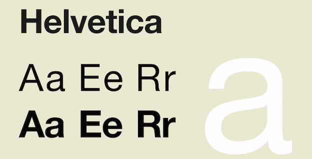
In this post, we’ll look at 30 extremely famous logos all derived from Helvetica. That’s less than half of the big brand companies out there whose logotypes are based on this font, but a good sampling nonetheless—one that shows how a single typeface can work across industries from motorcycles (Harley-Davidson) to makeup (NARS).
Related articles:
-
Fonts That Used By Famous Brands In Their Logos
-
The 15 Best Fonts to Use This Year
-
78 Best Free Fonts for Designers
Here are the names of the famous brands that use Helvetica font as a commercial wordmark:
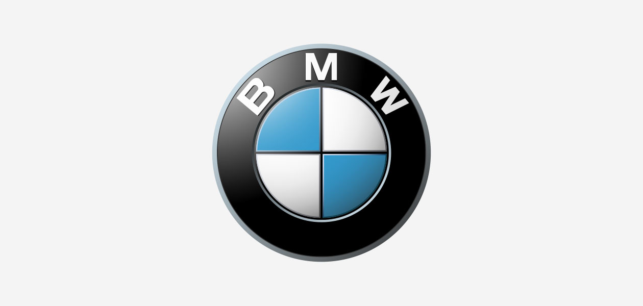
1. BMW
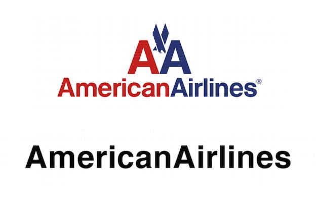
2. American Airlines
3. LG
4. Microsoft
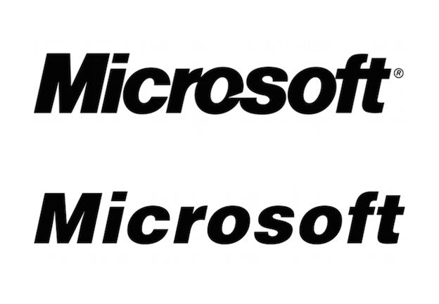
Microsoft starts from Helvetica Black Oblique, the italic variant of the heavy font, and makes itself unique through a distinctive ligature between the “f” and “t,” as well as one between the “o” and “s” that takes a cut out of the former.
5. Panasonic
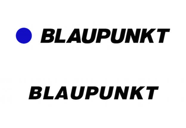
Both the Japanese manufacturer Panasonic and the German manufacturer Blaupunkt stay very close to standard Helvetica typefaces, spicing them up mainly with color.
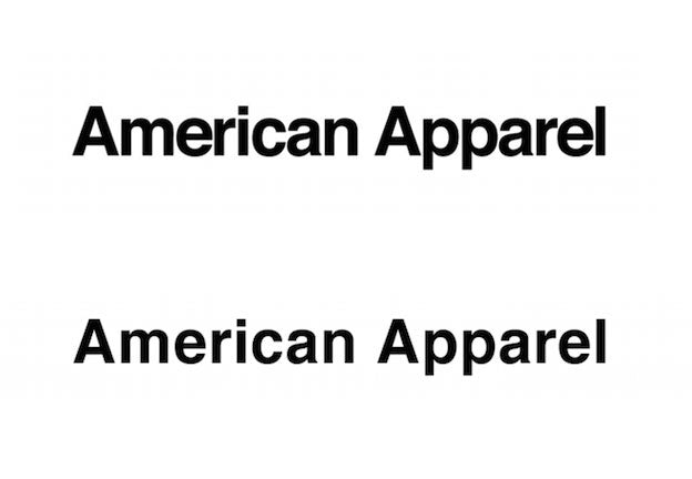
6.American apparel
7. Oral-B
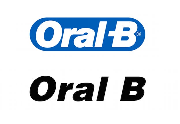
Oral-B, which makes toothbrushes and other dental care items, totally transforms its base font through an interesting ligature between the “r” and “a”—weirdly reminiscent of Microsoft, now that we look at it—and another that elides the dash with the B.
8. Bendix
9. The North Face
The North Face, by contrast, totally transforms the font through vivid color and text right-aligned with a graphic emblem which we interpret as a cliff, appropriate for the outdoor outfitters.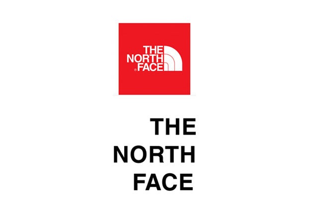
10. A&E
11. Crate & Barrel
12. Toyota
13. Nestlé
Likewise, the Swiss chocolatier Nestlé makes use of its national typographic inheritance, but implements major changes, rounding all the corners and adding a distinctive bar. Then they put a bird on it.
14. Motorola
15. Skype
Skype, meanwhile, starts with Helvetica Rounded Bold, smashes the letters together and encloses them within a friendly bubble. Not our favorite aesthetic, but it is recognizable.
16. Blaupunkt
While Panasonic absorbs this into the letters themselves, Blaupunkt isolates it within an emblematic blue dot.
17. Jeep
Jeep remains much more similar to its source, but widens the loop of the “J,” drops and tweaks the “e”s and rounds the inside points of the “p.”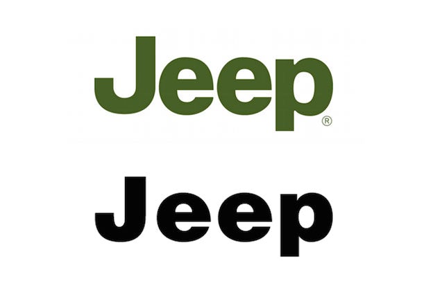
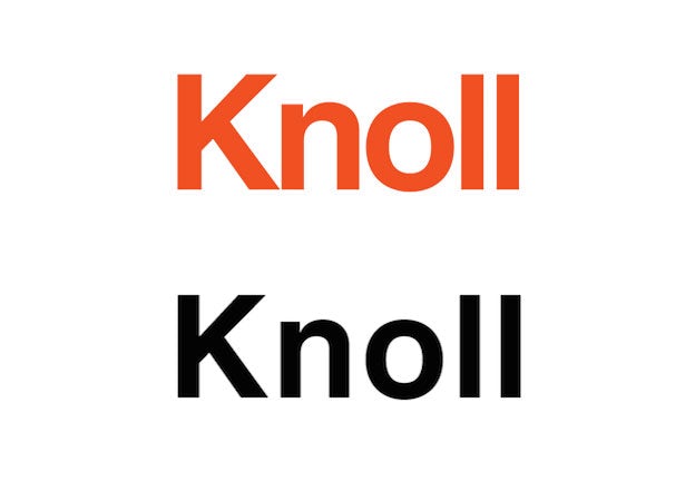
18. Knoll
Knoll’s logo relies more on the impact of its signature color.
19 . Ambitious about Autism
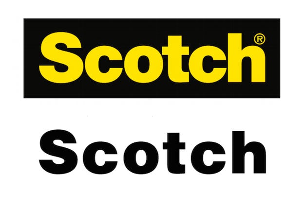
20. Scotch
We’re not sure if the Scotch logo is very successful apart from the signature plaid pattern found on its tape products, which carries much of the brand mark’s mnemonic weight.
21. General Motors
22. Harley Davidson
Would you have ever guessed that Harley Davidson, the quintessential symbol of masculine Americana, was based on a Swiss typeface? Granted, there are significant changes here, to the point where very little other than the basic shape of Helvetica Extra Compressed remains – although can definitely see it in the “D”s.
23. Dole
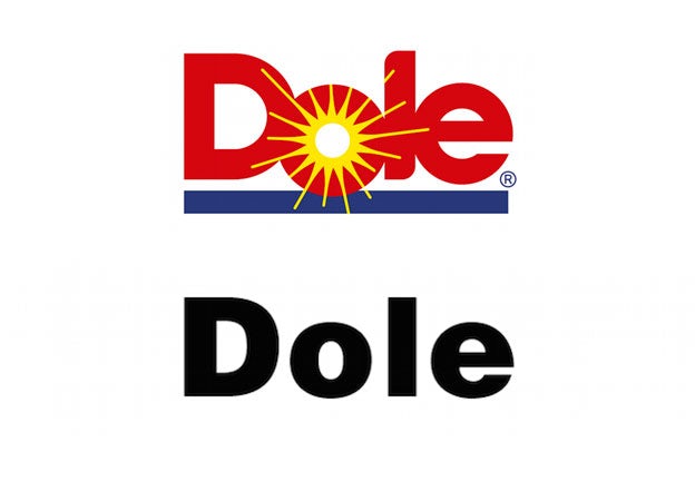
Talk about big differences here! Could you imagine a bigger disparity between the bold, tight and bright Dole logo, which rounds the “o” into a sun and adds curves to the “l,” and its standard, drab appearance in Helvetica Black?
24. JCPenney
25. 3M
The simply named 3M, on the other hand, soars to great heights by mashing its two glyphs together and closing in the “3” somewhat.
30 Sample of Helvetica Font used in Giant Brands
26. Target
Target’s logo is pretty uninspiring, frankly, but it is effective—a thickened up version of Helvetica Bold (not quite as thick as Helvetica Black) with a target sign whose rings are of equal weight.
27. JC Penney
JC Penney is nothing to write home about, either, but is noteworthy for being one of few companies to make use of Helvetica’s slimmer variety, Helvetica Light.
28. Kawasaki
29. Lufthansa
Lufthansa is also pretty close to Helvetica Black, but introduces some slight changes to the thickness of certain elements—for example, the vertical shaft of the “L” and the top of the “a”—that really takes it from good to great. Plus, love that orange.
30. NARS
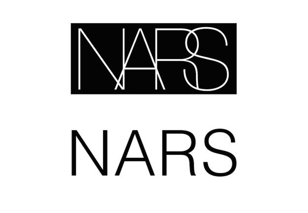
NARS transforms Helvetica Light (we think) with equal bravado by slimming down the characters even further and overlapping them.
Industry of Brands that used Helvetica font for their logo’s: Airlines brands using Helvetica, Clothing brands using Helvetica, Furniture brands using Helvetica, Tech brands using Helvetica, Electronics brands using Helvetica, Vehicles brands using Helvetica, Office supplies brands using Helvetica, Department stores brands using Helvetica, Cosmetics and hygiene brands using Helvetica, Food brands using Helvetica
That’s just to name a few, and of course, the exact route you take will depend on your brand and brief
Conclusion
In sum, you can take a basic typeface and turn it into logo potential through the following types of tweaks:
- Tightened kerning (the distance between letters)
- Unique alignment (like in the North Face logo)
- Added ligatures (connected letters)
- Modified glyphs (slightly changing the shape of the letters)
- Color
- An emblem or other graphic component
Helvetica will continue to be used for a long time to come as it maintains its boldness and obviousness at any font size, and easy to read for almost everyone.
Don’t miss these posts too:
- 26 Free Minimal Fonts by Designers for Designers
- 20 Best 2022 Free Calligraphy Fonts
- 40 Best Free Outline Fonts For 2022
- 30 Bold Fonts for Designer In 2022
- 37 Fonts Used by Super Famous Brand
- 36 Outstanding Free and Premium Fonts for Your Next Project
- 110 Best Free Fonts for Branding and Identity Design
