A logo is a powerful tool for creating brand recognition and identity. It visually represents a brand and communicates its message to the target audience. A well-designed logo captures the essence of a brand and conveys its values, personality, and vision. Therefore, it is crucial to invest in a logo that is memorable, evokes positive emotions, and stands out from the competition.
In this article, we provide 21 of the best logo design tips to help you create a logo that resonates with your target audience and sets your brand apart. These tips include understanding your brand’s values and personality, researching your target audience and competitors, choosing the right colors and fonts, using negative space, and experimenting with different design elements.
By following these logo design tips, you can create a logo that not only looks great but also reflects your brand’s identity and resonates with your target audience. Remember, a logo is not just a design, but a representation of your brand. Therefore, invest the time and effort to make it count!
1. Understand the Brand
Before beginning the logo design process, it is crucial to conduct a thorough examination of the brand’s identity, values, and mission. It is also important to study the brand’s target audience to gain a better understanding of their behavior, preferences, and interests. This will help in creating a logo that perfectly represents the brand and appeals to its audience. Additionally, researching the competition to identify their branding strategies and design elements is recommended. Doing so will ensure that the brand’s logo stands out in the market and communicates a unique message to its customers.
2. Keep it Simple
When creating a logo for your brand, remember that simplicity is key. A simple logo is easier to remember and recognize, while a complex one may only look good on a large billboard. It is crucial to ensure that your logo is easily recognizable and not too complex, as it should be versatile enough to be used across various mediums, including digital and print. Moreover, a simple logo can convey professionalism and sophistication, which can help your brand stand out from competitors.
3. Use Appropriate Colors
Colors have the power to evoke emotions and significantly impact how people perceive a brand. When designing a logo, it is crucial to choose the right colors as they can create a lasting impression on the target audience. The colors used in a logo can influence the perception of a brand’s values and personality. For example, blue is often associated with trust and reliability, making it a popular choice for brands that want to convey a sense of security. On the other hand, red is often associated with passion and excitement, making it a popular choice for brands that want to evoke a strong emotional response.
However, it is important to note that the interpretation of colors can vary across cultures, which makes it crucial for businesses to consider the cultural context of their target audience while selecting colors for their logo. Additionally, it is important to ensure that the colors used in a logo are visually appealing and create a harmonious balance. A well-designed logo can help create brand recognition and differentiation in a highly competitive market.
4. Choose the Right Font
When designing your logo, the font you select plays a crucial role in shaping the overall impression that your brand leaves on its intended audience. Therefore, it is equally important to choose the right font as it is to select the perfect design and color scheme. The font you choose has the power to convey your brand’s personality, values, and message in a way that resonates with your target market.
To make your logo stand out from the competition, consider using a custom font or a unique typeface. Taking the time to carefully select a font can help ensure that your brand is seen as distinctive and memorable, leaving a lasting impression on those who encounter it.
5. Be Creative
When creating a logo, it is essential to ensure that it stands out from the competition and is unique. A logo is the face of a brand and should be memorable, recognizable, and effectively communicate the brand’s values and message to the target audience. To achieve this, it is essential to be creative. Experiment with different color schemes, typography, shapes, and symbols to create a logo that catches the eye and leaves a lasting impression on people’s minds. It is also crucial to consider the context in which the logo will be used and ensure that it is scalable, versatile, and relevant to the brand’s identity and industry. Overall, creating a great logo requires a combination of creativity, strategy, and attention to detail, and it is worth investing time and resources into getting it right.
6. Make it Scalable
When designing a logo, it is important to keep in mind that it should be versatile and look great across a variety of mediums and sizes. This means that you should consider the different sizes and formats in which the logo will be used, such as on business cards, websites, billboards, and social media platforms. It is crucial that the logo looks good and is easily recognizable in all of these formats. Additionally, you may want to consider designing different versions of the logo for different applications. For example, you may want a simplified version of the logo for use on social media profile pictures or in small spaces. The possibilities are endless, but the key is to create a logo that is both visually appealing and functional across various mediums and sizes.
7. Test the Design
Before finalizing the design, it is important to test the logo on different mediums and sizes. This will enable you to identify any issues and make necessary changes to the design.
Testing the logo on different mediums and sizes is crucial because each medium and size can significantly impact the way the logo looks. For example, a logo that looks great on a computer screen might not look as good when printed on a business card or billboard. Similarly, a logo that looks great in color might not be as effective in black and white.
Furthermore, testing the logo on different mediums and sizes can help ensure that it is legible and easily recognizable in all situations. Overall, taking the time to test the logo can help you create a visually appealing and effective representation of your brand.
8. Be Timeless
When designing a logo, it is important to remember that it is not just an image or symbol, but rather a representation of a brand’s identity. As such, a logo should be carefully crafted to be timeless and remain relevant for years to come. This means avoiding the use of trendy designs or fonts that may quickly become outdated. Instead, focus on creating a design that reflects the brand’s values, mission, and personality, while also being versatile enough to adapt to changing times and trends.
A well-designed logo can help a brand establish itself as a leader in its industry, while a poorly designed one can detract from its credibility and lead to negative associations with the brand. Therefore, taking the time to create a thoughtful and well-executed logo is an investment in the long-term success of the brand.
9. Consider Negative Space
Negative space, also known as white space, is the area in a design that is left blank or unmarked. When used correctly, negative space can add depth and meaning to a logo design, giving it a sense of balance and sophistication. In fact, some of the most iconic logos in the world, such as the FedEx logo and the Nike swoosh, use negative space in a creative and effective way.
One way to use negative space in your logo design is to create a hidden image or message within the space. This can add a layer of intrigue and interest to your logo, as viewers try to decipher the hidden meaning. Another technique is to use negative space to create a sense of movement or direction within the design. This can help convey a sense of energy and excitement, particularly for brands in the sports or fitness industry.
It’s important to use negative space carefully and intentionally, as too much or too little can have a negative impact on the overall design. Additionally, negative space should be used in conjunction with other design elements, such as color and typography, to create a cohesive and visually appealing logo. So next time you’re designing a logo, consider incorporating negative space in a creative and effective way to make your logo stand out from the crowd.
10. Use Grids
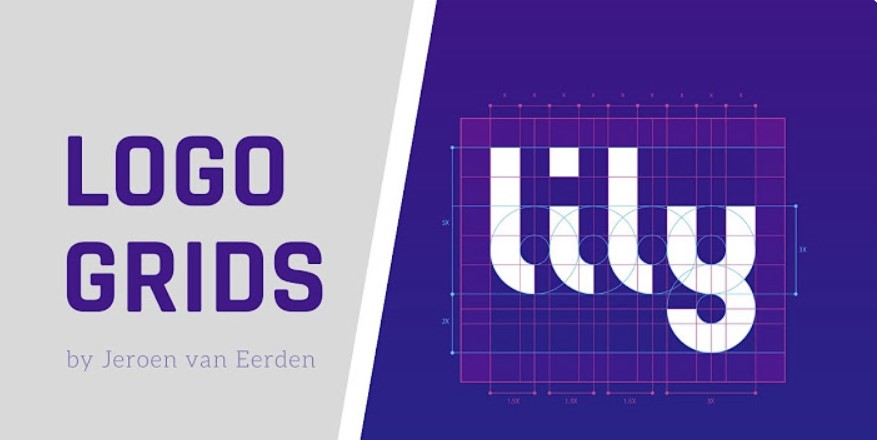
Using grids in logo design can be an incredibly helpful tool. Not only does it provide structure and organization, but it can also help to create a more balanced and visually appealing design. By dividing the design into smaller sections, grids can assist in creating a cohesive and harmonious logo that effectively communicates the intended message.
In addition to providing structure, grids can also streamline the design process. Breaking down the logo into individual elements makes it easier to experiment with different variations and combinations, leading to a more refined and polished final product.
It’s important to keep in mind that the use of grids in logo design is not a one-size-fits-all solution. While it can be incredibly effective in certain cases, it’s not always necessary or appropriate. Ultimately, the decision to use a grid should be based on the specific needs and goals of the project, as well as the personal preferences of the designer.

11. Be Consistent
To create a successful logo, it’s important to ensure consistency across different mediums and formats, including print, web, and social media. Consistency helps build brand recognition and awareness while ensuring that consumers can easily recognize your logo across all channels. In addition, a consistent logo can establish professionalism and credibility, which can help build customer trust and loyalty. You should also carefully consider the color scheme and typography of your logo, as these elements can significantly impact its effectiveness and overall appeal. By taking all of these factors into account and designing a logo that is visually captivating and consistent, you can effectively communicate your brand’s identity and values to your target audience.
12. Use Contrast
Contrast is a powerful tool that can add visual interest and make a logo more memorable. When designing a logo, it’s important to consider how contrast can be used creatively to make it stand out from the competition. There are many ways to incorporate contrast into your logo design, such as using contrasting colors, different typefaces, or contrasting shapes and lines. By experimenting with different types of contrast and incorporating them into your logo design, you can create a visually appealing and memorable logo that effectively represents your brand. So don’t be afraid to get creative with contrast when designing your logo – it could be just the thing you need to make your brand stand out in a crowded marketplace!
13. Consider Proportion
When designing a logo, it is essential to pay attention to proportion. By keeping the proportion of different design elements in mind, you can create a logo that not only looks visually appealing but also feels balanced. It is important to remember that proportion is not just about the size of individual elements but also about their placement and how they relate to each other. A well-proportioned logo can convey a sense of harmony and professionalism, while a poorly proportioned one can appear cluttered and unappealing. Therefore, taking the time to carefully consider proportion during the design process can make all the difference in the success of a logo.
14. Use Negative Space Creatively
Negative space, also known as white space, refers to the area around and between the elements of a logo design. This space is left unmarked and empty, and can actually add depth and meaning to a logo. By skillfully using negative space, you can create a unique and effective logo that stands out from the crowd. Negative space can be used to convey hidden meanings, create optical illusions, or simply draw attention to the design. Additionally, it can help balance the elements of the design and make it more aesthetically pleasing. When designing a logo, consider the creative use of negative space, as it can truly enhance the impact of your design.
15. Experiment with Shapes
One way to create a unique and effective logo is to experiment with different shapes. For instance, you could try using irregular shapes or combining multiple shapes in a creative way. Another option is to incorporate shapes that are relevant to the brand or industry. By exploring various options and pushing the boundaries of traditional logo design, you can create a logo that stands out and resonates with your target audience.
16. Use Symbolism
Symbolism can add significant depth and meaning to a logo design, effectively setting your brand apart from others. By incorporating symbolism, you can create a unique and memorable logo that resonates with your target audience, communicating your brand’s values, beliefs, and personality in a way that words cannot express. Furthermore, using symbolism in your logo design can make it more visually appealing and interesting, leading to increased brand awareness and recognition. Therefore, it is important to consider using symbolism creatively when designing a logo for your brand.
17. Be Bold
Incorporating bold design elements into a logo can be a powerful way to make a statement and increase brand recognition. Bold logos not only stand out and catch the eye, but also convey a sense of confidence and strength. When designing a logo, it’s important to consider how using bold elements can help communicate your brand’s values and personality. Additionally, using bold colors and fonts can make your logo more memorable and easier to recognize, which is particularly effective in today’s crowded digital landscape. By incorporating bold design elements into your logo, you can create a distinctive and memorable brand identity that will help your business stand out from the competition. Don’t be afraid to experiment with bold design choices when creating your logo and see how it can help your brand make a lasting impression.
18. Be Memorable
A memorable logo can leave a lasting impression on your audience. To achieve this, consider using unique design elements that resonate with your target audience. Doing so can help establish a strong brand identity and increase brand recognition. Incorporating creative concepts can make your logo stand out in a crowded market and differentiate your brand from competitors. Keep in mind that a logo often serves as a customer’s first point of contact with your brand. Therefore, it’s crucial to ensure it accurately reflects your brand’s personality and values. By taking the time to create a thoughtful and well-designed logo, you can set your brand up for success and establish a strong foundation for future growth.
The Amazon logo is memorable due to its minimalist design and subtle clues embedded within. The arrow pointing from A to Z is a clever way to signal that customers can buy everything from Amazon. These elements contribute to an image that is instantly recognizable.

19. Be Versatile
Versatility and adaptability are crucial when creating a logo. It is essential to ensure that the logo looks great across various mediums and formats, including print, web, and social media. Consider the different sizes in which the logo will be displayed, ranging from tiny favicon sizes to large banners. Additionally, think about the different color schemes in which the logo will be used, and ensure that the logo is designed to work well in both color and black and white. By considering these factors, you can create a logo that is not only visually appealing but also practical and adaptable to the needs of your brand.
20. Get Feedback
Before finalizing the design, it is important to gather feedback from others. One effective way to do this is by asking friends, family, and colleagues for their opinions and taking them into account. Keep in mind that they may offer valuable insights that you may have overlooked due to seeing things from a different perspective.
Another effective way to gather feedback is by conducting a survey. When creating the survey, make sure to keep the questions clear and concise, and tailor them to the target audience. This will help ensure that the feedback received is meaningful and relevant to the design process. By taking the time to gather feedback and carefully considering it, you can create a design that meets the needs and expectations of your audience.
21. Be different
It is crucial for your logo to differentiate your brand from the competition, as there are numerous other businesses vying for a spot in your industry. This may require taking some creative liberties with the design, such as exploring different colors, styles, fonts, and formats.
Failing to set yourself apart could result in your logo being overlooked by customers. However, standing out can offer several benefits, including:
- Allowing you to tell your own story
- Creating a more memorable representation of your business, which can help prevent confusion with other companies in your industry
- Establishing a value proposition for customers, giving them a reason to choose you over the competition
For instance, Twitter distinguishes itself from other social media platforms by relying on imagery over words. The bird logo represents the brand’s desired simplicity and the concise, meaningful messages users can share, akin to a bird’s tweet.

Conclusion
A well-designed logo can make a strong statement and create brand recognition. By following these 20 best logo design tips, you can create a logo that represents the brand and appeals to the target audience. Remember to keep it simple, use appropriate colors, choose the right font, be creative, and make it scalable. A great logo can take your brand to new heights and help you stand out in a crowded market.
Related posts with the logo:


