Super Famous Brand Fonts. Have you ever thought about what could be the best combination of fonts to put forward your logo designs, alluring traffic towards it? The answer is simple. Just two fonts that will highlight each other can be considered an option. It isn’t easy to put together fonts that are either inviting or may feel like too incited.
Think of the logos of Bayer and Fendi, Kappa and Energizer. They seem completely different at first glance, but they are inspired by the same font, Helvetica, which is considered the champion in popularity for brand identity development due to its versatility.
This is quite a common situation for branding: many companies choose the same typography when developing their corporate identity. At the same time, their personality is emphasized in some ways.
Are you looking for a perfect font that would convey the nature of the company, be easy to read, and look relevant? We offer you to learn from the experience of well-known brands. You’ll find out the 13 popular fonts they use and who they will suit.
To get inspired to create your own logo, we suggest exploring several popular types of typography.
Before we start, if you are curious about the world of fonts Make sure to check the Best Popular Fonts too.
1. Choplin
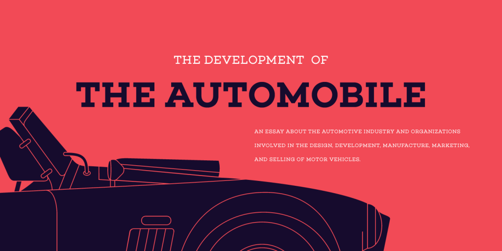
This pure geometric font based on the Campton font family was created by the modern German designer René Beider. The round letters with neat serifs look laconic and are easy to read. Choplin is often used not on logos but in printed marketing materials.
2. Garamond
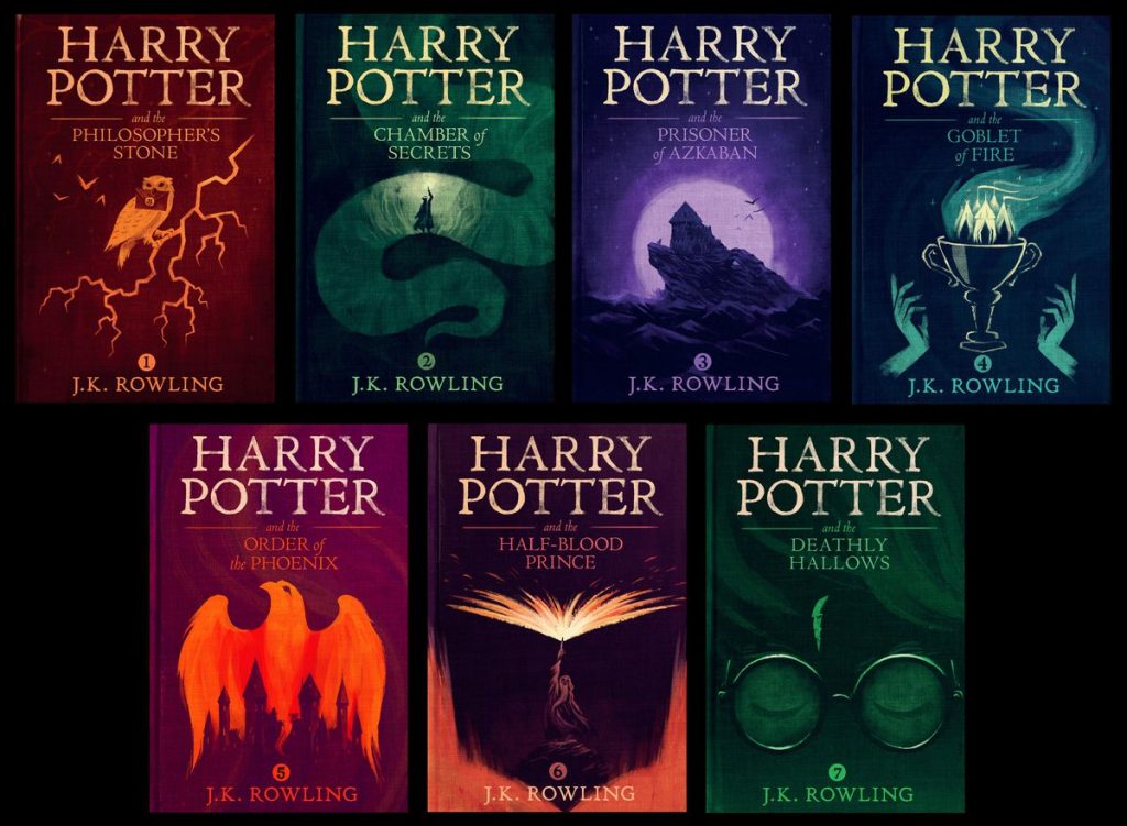
One of the oldest fonts developed in the 16th century in France by Claude Garamond influenced the whole European typography. Today Garamond is a family of different typefaces characterized by small serifs, moderate contrast, and rounded shapes.
3. Futura
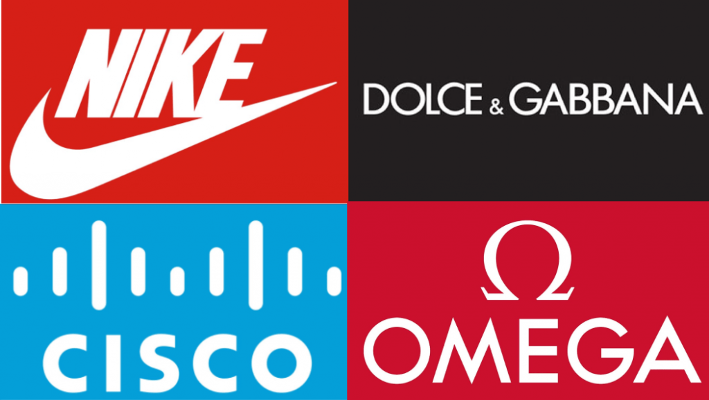
The font appeared in the early 20s in Germany, in the era of numerous artistic experiments associated with the Bauhaus style. Today, Futura has become a classic serifless font. Due to its geometric shape, the letters look simple, clean, modern, and easy to read on any medium.
Futura is very common for branding: Nike and Cisco, Dolce Gabbana and Gillette, Omega and PayPal, posters for dozens of movies including “Gravity”, “Interstellar”, “American Beauty”. Fortunately, the variety of styles allows adapting to almost any business.
Companies that choose Futura for their logo should be creative in order not to merge with other brands and show their personality.
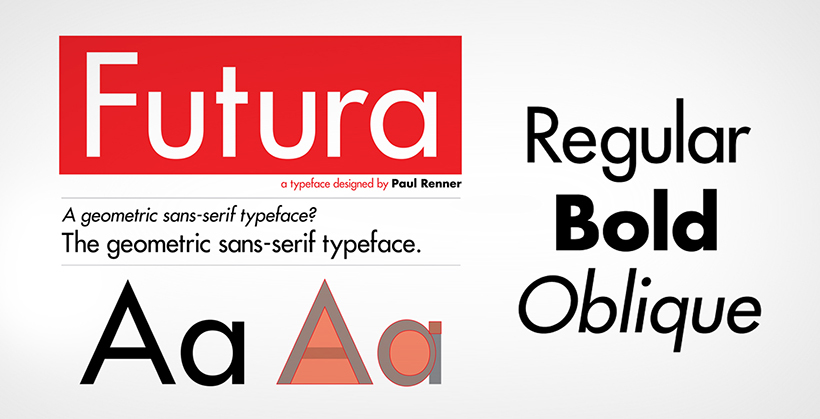
The sans serif category has a diverse range of famous fonts that have growing demand by the logo designers. Nike and Cisco are famous fashion brands entitled with fascinating designs in the company’s logo with Futura as the font. As astonishing as it sounds, Redbull has plied the same typography in Futura BQ with dark and bold characters.
4. Univers
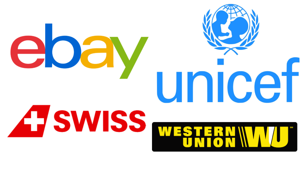
It was designed in the 1950s by the Swiss designer Adrian Frutiger. He wanted to avoid perfect geometry and kept “visual sensitivity between thick and thin lines.”
The modern Univers is a large and popular serifless font family used by well-known brands (eBay, Swiss International Airlines, BP, Unicef, Western Union) and municipal and transport services (street navigation in London, Toronto Metro, Frankfurt Airport).
Univers is suitable for brands looking for simple, versatile, and readable typography.
5. Pico
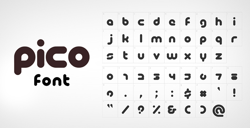
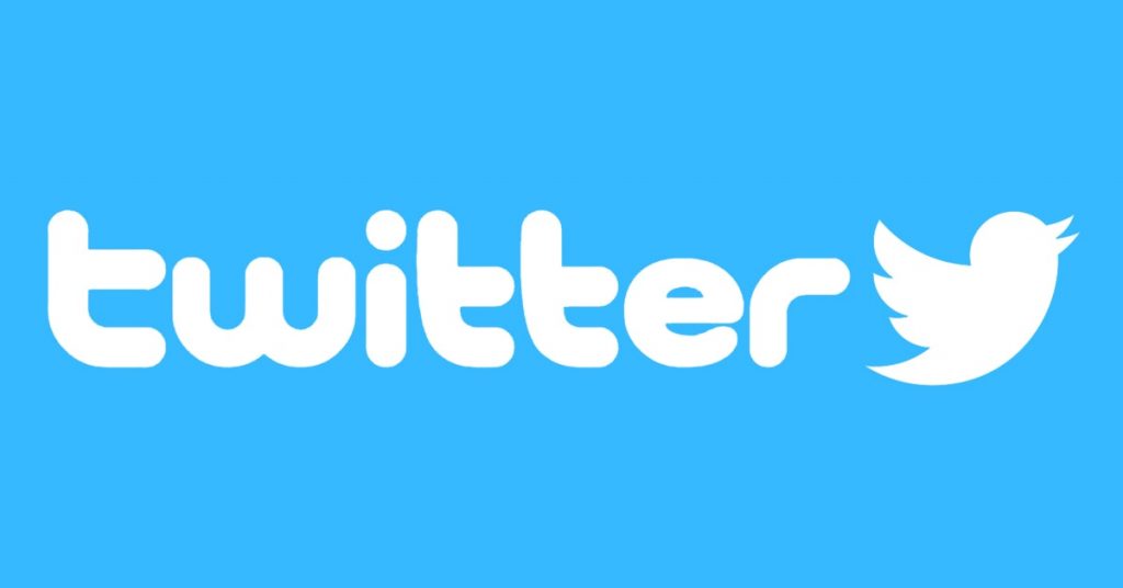
This playful font was released in the early 2000s by the Japanese company Maniackers Design. Pico is easy to recognize by its soft rounded lines such as in the Twitter logo. This typeface is perfect to convey the mild, friendly nature of business.
6. Myriad
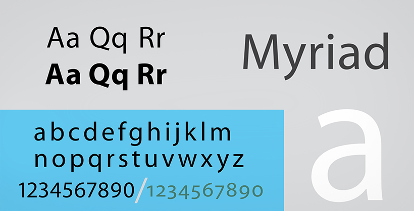
In 1992, designers Robert Slimbach and Carol Twombly developed a new typeface for Adobe. The lack of serifs, clean forms, well-drawn proportions of letters made it readable and universal.
Myriad can be seen in the branding of Apple until 2017, Wells Fargo, Modern Telegraph, Nippon Airways, LinkedIn, Rolls-Royce, Walmart. It is worth using if you want to convey simplicity and laconicism.
7. Centra
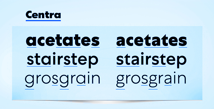
It is a geometric type of design with a modern touch, making it obtrude. The font became deliberately famous when it was used by Yahoo, giving it a look of a professional yet creative approach.
8. Baltica
This font was developed by the team of Soviet designers in the early 50s of the 20th century. Although it is close to a slab serif, it is distinguished by its thin and direct serifs.
Due to its good readability, Baltica is often chosen for media. It can also be seen on the Winston logo. This type of typography is suitable for brands with classic style.
9. ITC Lubalin Graph
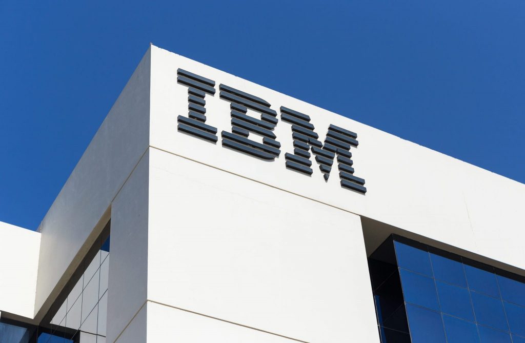
The design of the geometric font, presented in 1974 is based on ITC Avant Garde Gothic. Intensive serifs were added to it, and the letters were placed closer to each other. Their sharp bends make the inscriptions more dynamic.
One of the bold inscriptions of ITC, Lubalin Graph, was used for the IBM logo. Such an identity conveys the energetic, but not aggressive nature of the company.
10. Avenir
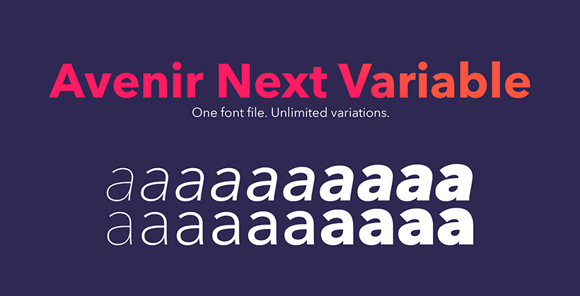
Avenir is an interpretation of the future context that makes it fascinating to the eye. It has developed an attraction because Avenir creates a logo design no matter what the decade, but it is still intruding and visionary. Toyota logo is one of the popular programs; this logo gave a creative look.
11. Gill sans
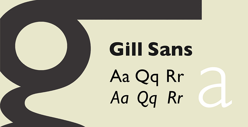
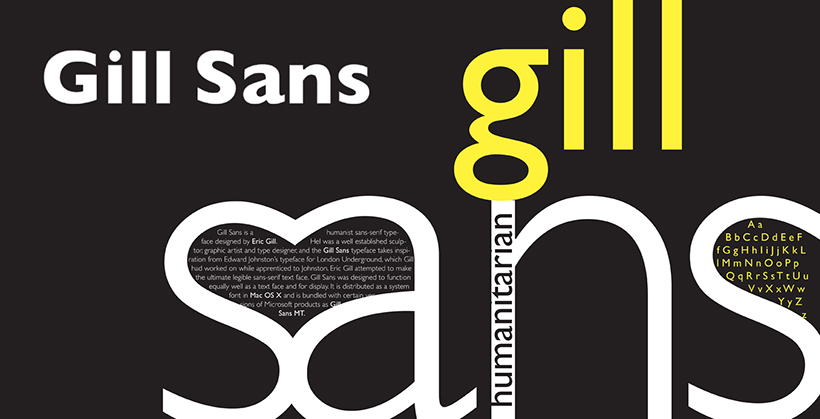
The font gill sans is typography that does not have small serifs in the design. It is the reason fashion company Tommy Hilfiger has used this font in the logo. It makes the logo look innovative, stylish, and somehow very pleasing to the eye.
12. Unisect
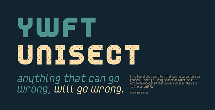
The brand famous for selling submarine sandwiches around the world has used Unisect font in its logo design. The company has made the logo more approachable and easy to read and forecast the marine style. The font is captivating and modish, making it visible from afar. In 2016, Unisect Black got more attention as compared to the past decades after the change in font style.
13. Klavika
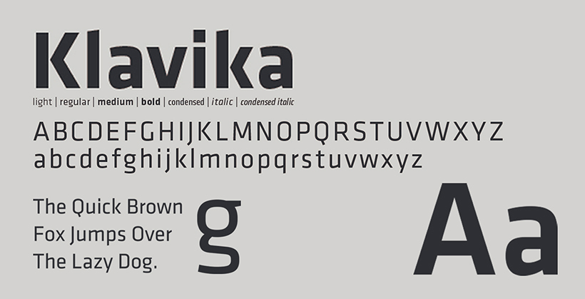
This font designer has gathered up a mix of prolific, contemporary, and prominent look with a light artistic impression.
The flexible characters of this font are easily distinguishable without the audience’s eye embedding onto one typograph. The family of Klavika has gained considerable attention after the successful use of the famous Facebook logo.
14. Avante Garde
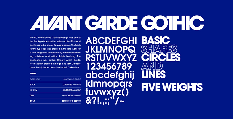
It is a precipitated sans-serif typeface that has most use in headlines and shortline texts. It is unique typography that is attractive, which is the reason famous brands like Adidas, and Calvin Klein have used regular, italic, and bold structures. It fabricates the logo with a more daunting and elegant look.
15. Helvetica
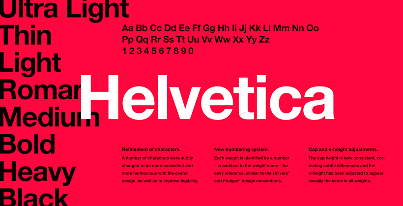
If the graphic designer is looking to make the logo more approachable and modern with a slight touch of vintage, Helvetica is their go-to style. The Famous caterpillar brand has used simple Helvetica in its logo font. Energizer has used italic Helvetica to give it a more daring and adventurous look. Whereas, WhatsApp has used the same font in the nene style with a vivid and business structure.
You might like this post as well: 30 Sample Of Helvetica Font Used In Giant Brands
16. Alternate Gothic
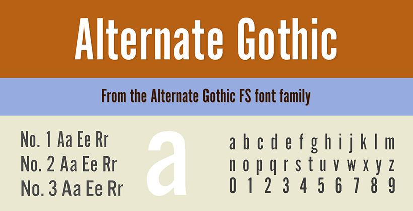
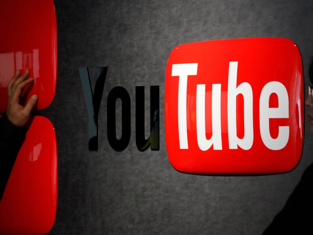
Youtube has condensed letters in its logo. This type of font style is an Alternate gothic that is versatile with imaginative design leaving an artist’s impression. It is the digital enticement of the appropriate and prominent draft.
The gothic typeface without serifs was drawn by Morris Fuller Benton in 1903 as an analog of Franklin Gothic. It is characterized by the letters stretched in height and narrowed in width – as on the emblem of YouTube. Alternate Gothic is worth considering if you want to convey a strong confident nature of the brand.
17. Proxima Nova
Proxima Nova is often called the new Helvetica because of its versatility and modern appearance. According to designer Mark Simonson who created this font in 2005, he “tried to make the letter shapes simple and clear.”
The combination of classic geometry and modern proportions has made the family of 48 fonts one of the most popular: today it is used by thousands of websites including BuzzFeed, Mashable, and NBC News.
“Proxima Nova works best in situations where you need something invisible that doesn’t draw attention to yourself,” Simonson says. – In fact, it doesn’t convey anything except for the words you wrote in it.” This means that Proxima Nova will look better not on the logo, but a website or a corporate blog.
18. Billabong
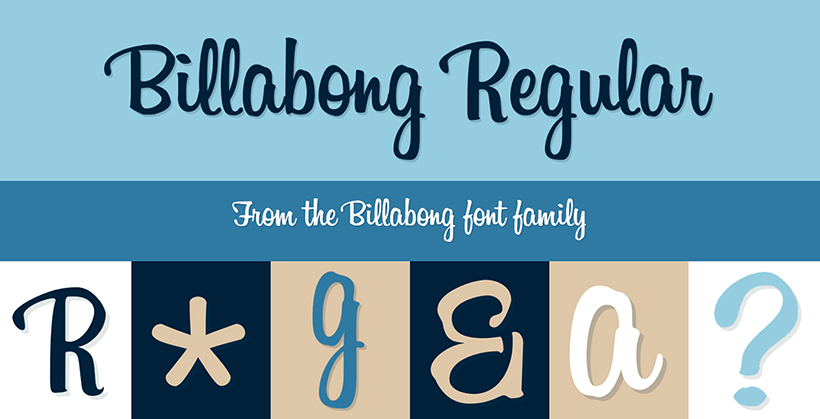
Billabong got the push for approaching the designers after it was used in the logo of Instagram. This font applied in the short lines and undertexts of logos is the reason many artist impressions have involved this typograph.
19. Segoe UI
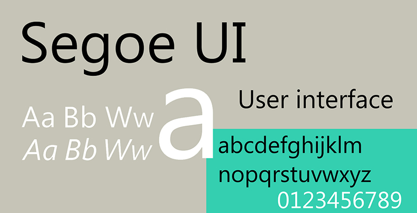
Segoe UI can be used in Microsoft Windows only, preferable Linux. It is the reason to bring forward the company’s font design, and it maneuvered in making the original logo of Microsoft, presenting it with a professional look.
20. Neo Sans
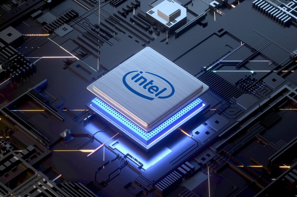
In 2004, the British designer Sebastian “Seb” Lester drew a universal futuristic font that would not look “rough, useless, or ephemeral”. The lack of serifs and intense rounding create a friendly mood.
You can recognize Neo Sans in the Intel logo as well as in urban navigation, e.g. in the British public transport companies. It is worth choosing if you want to create an image of a brand that is close to consumers and easy to understand.
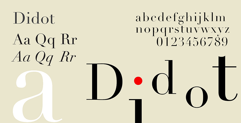
21. Didot
It was named after the French family Didot who were engaged in book printing and type producing in the 18th-19th centuries. Circular lines, contrast, and small serifs create an impression of chic and status. During a survey conducted by writer and printer Sarah Hindman, the audience rated Didot as the most expensive font.
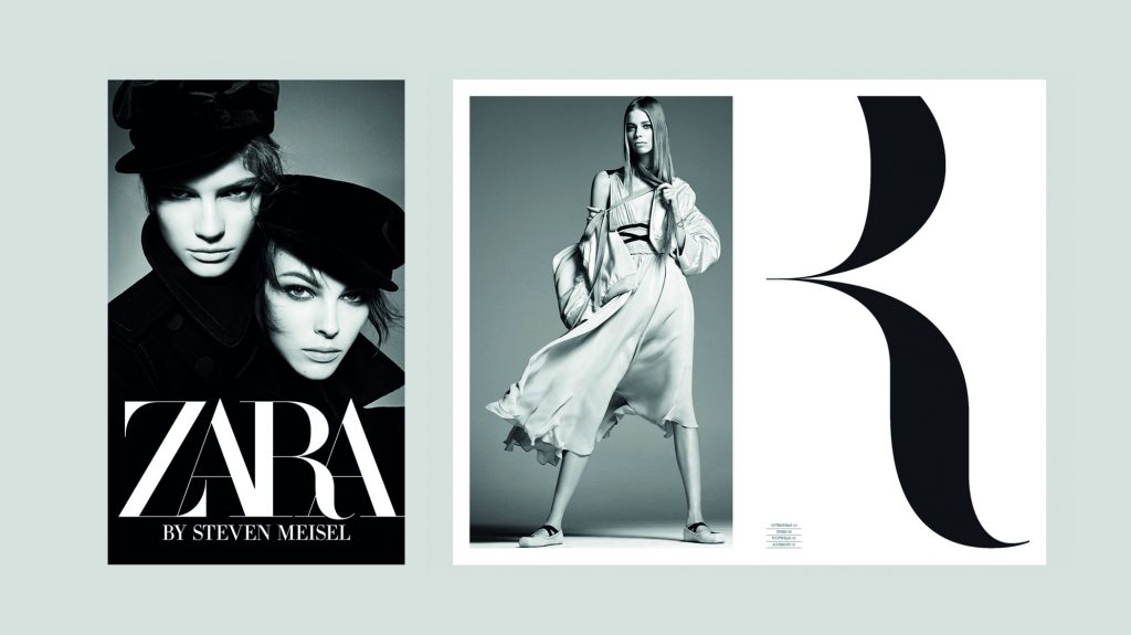
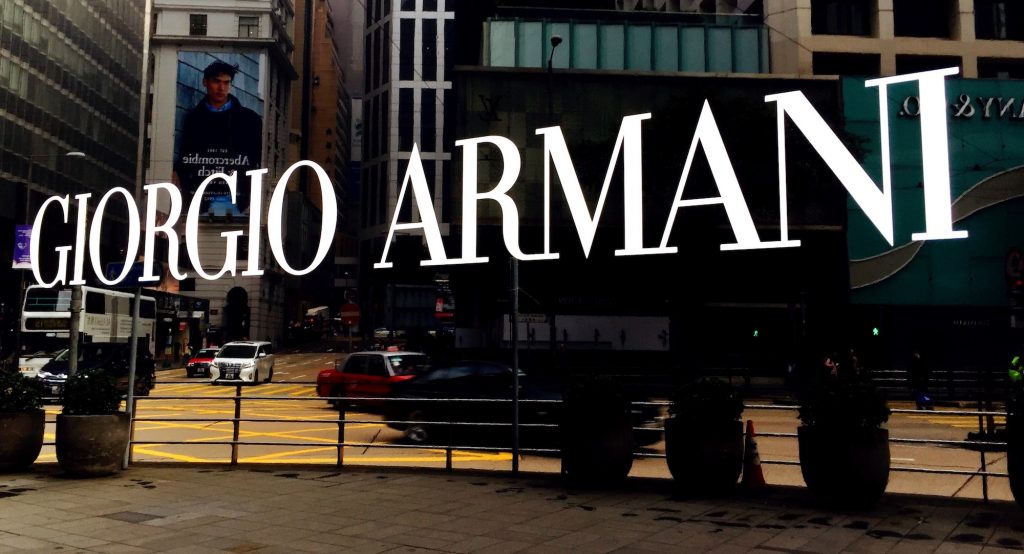
Similarly to Bodoni, Didot is popular in the world of fashion and creativity (Giorgio Armani, CBS, Zara). It is suitable for companies that want to look expensive, mature, and stylish.
22. Bebas Nene
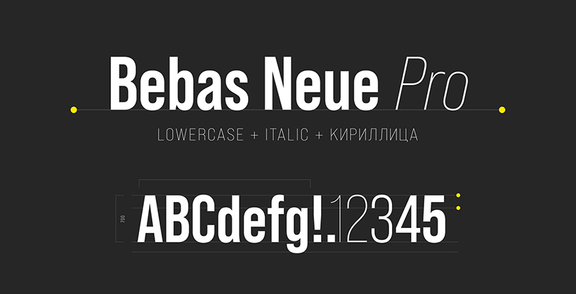
The famous online site for watching movies and series, Netflix has this font in outward form, according to the demand with enticing and inviting red color. This combination proffers an enthusiastic draft alluring and ultra-modern vision. The best logo design agency provides Bebas Nene as a use in the font for a modish glance.
23. Gotham
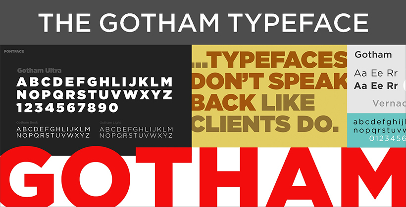
Gotham is a high costing sans serif style font. Like Spotify, many famous music launchers have used this font in the logo to give it a creative yet enchanting bold look. Similarly, Discovery Channel has fearlessly fashioned the characters in medium style for an adventurous approach.
24. Freight Sans
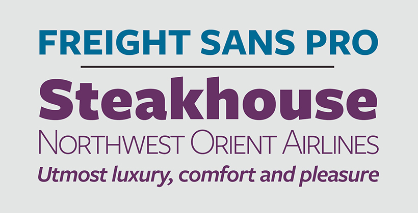
Freight Sans is famous for its versatile black and bold, valiant gape along with the enticing characters used in the Reed & Mackey for a captivating look. It is the sans serif family also used in the text line of StarBucks.
25. Price Down
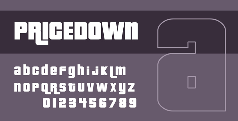
The Price down introduced through the game graphics of Grand Theft Auto has the characters that are bold, melting, and distinguishable, along with having to make it up to the productive impression of the available site. Although the font is made of condensed characters, the sign is still easily readable without clarity.
26. Frank Furter
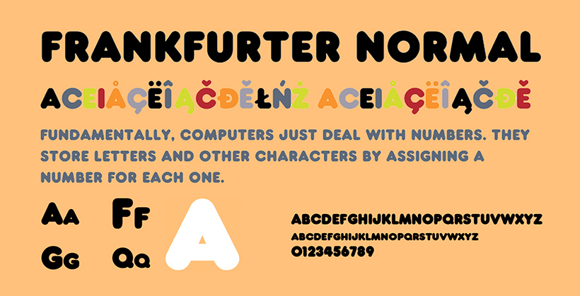
One of the reasons why Frankfurter has achieved the triumph is owing to the characters’ curved terminals. It has become an obsession for so many designers in a creative approach as well as the digital logo artists of Kickstarter implied this sans serif typeface for putting forward the real meaning of the brands business.
27. Johnston
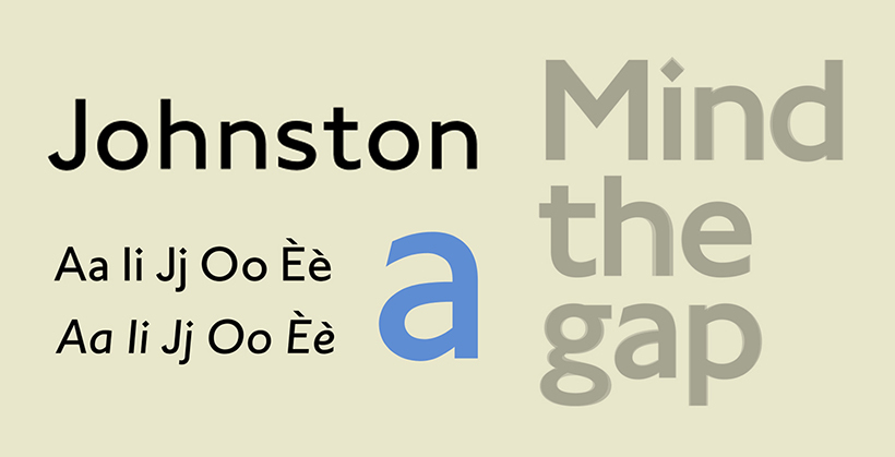
Johnston has distinctive diamond-shaped characters. The characters of the Underground are slightly spaced, meaning to give it an approachable look.
28. Officina Sans
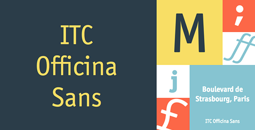
Officina sans has become an alluring entitlement for the users since it generates a captivating and eye-catching approach to the audience. At first glance, the font sights talk about the theme it is trying to promote and the specific characters that have established vividness. Amazon’s logo design is an example of this sans serif font, which is successful in every aspect.
29. Kabel
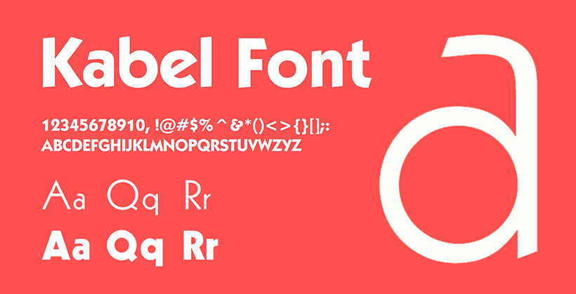
The German scriptwriter, Rudolf Koch, introduced Kabel and released it in 1927. The American game, Monopoly, has used this style in the bold logo designing of the famous game throughout the world. It has reached a height of well-appreciated and sophisticated regard.
30. Debussy
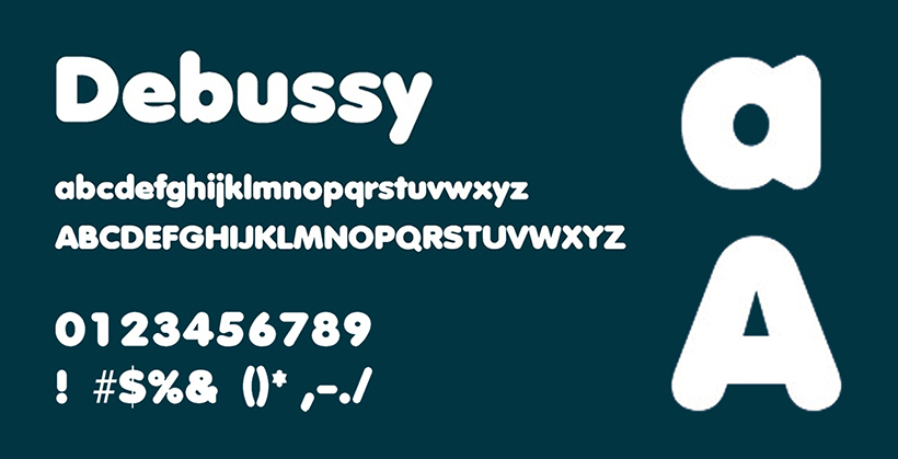
The curved terminals and bold look of the font was the reason Dunkin Donuts opted for this logo. This style has conferred a go-with-the-flow look for the company. The doughnuts are ring-shaped, and the width is also more. The characters of this style are also round at terminals and more in the span.
31. Trajan
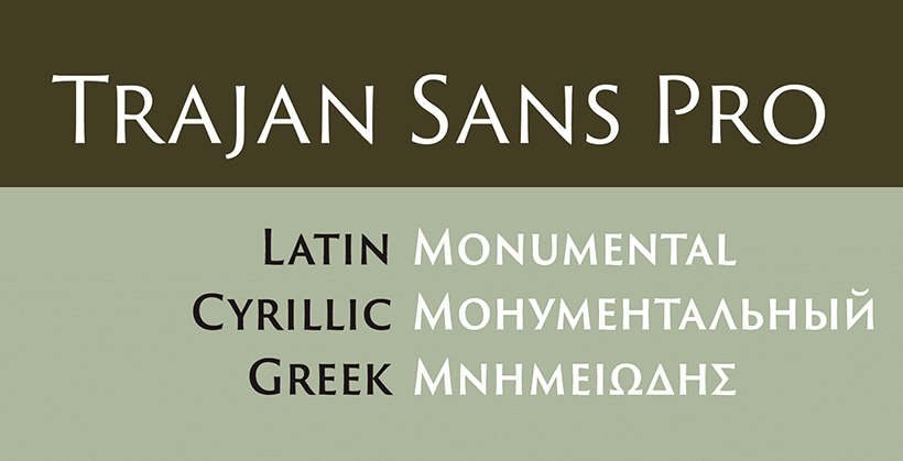
The lines of some letters are in expanded form, as well the characters are roman type. Itis the reason Game of Thrones; the most-watched TV series has made the title more engaging for the viewers. The Trajan Pro has constructed a robust logo.
32. Corporate A
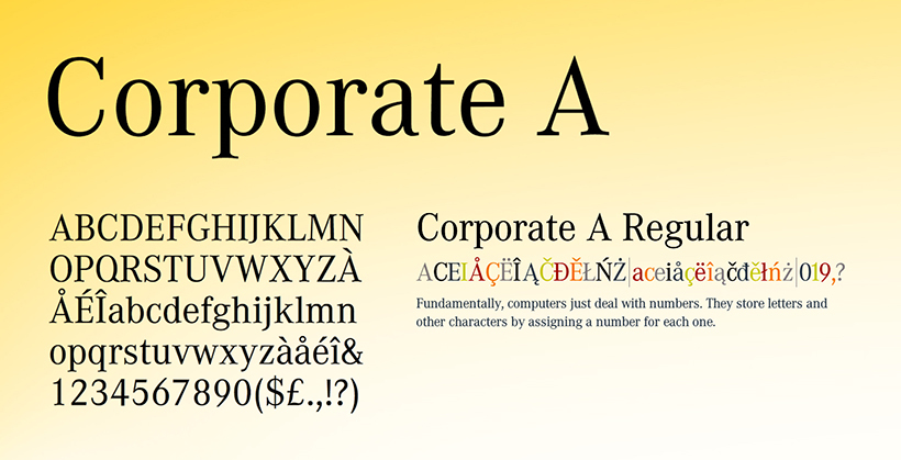
The famous san serif style typography, Corporate A, was made in the OpenType. Mercedes Benz is a famous user of this font style. Also applicable to the body text, this script stands out on printed paper.
33. Clarendon
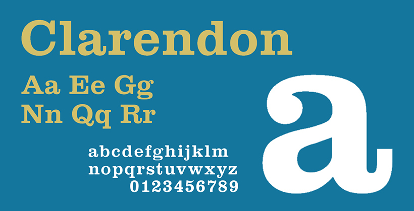
To give the title a more vintage look but at the same time, keep it updated with the on-going century, Rolex is one of the well-known brands that has used this script in the logo. The characters are in Roman design as well as versatile.
34. Interstate
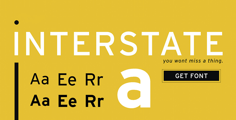
Soundcloud has interstate font in its design since it is captivating with alluring characters. However, the custom logo design is a digital imprisoned character with an unflinching yet fascinating look going with the brand’s theme.
35. Lovin’ Sans
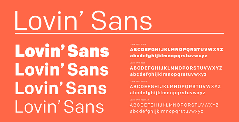
The famous McDonald’s logo has this style looking chic. The characters are slightly curved at terminals, which look more captivating with a bold look.
36. Bodoni
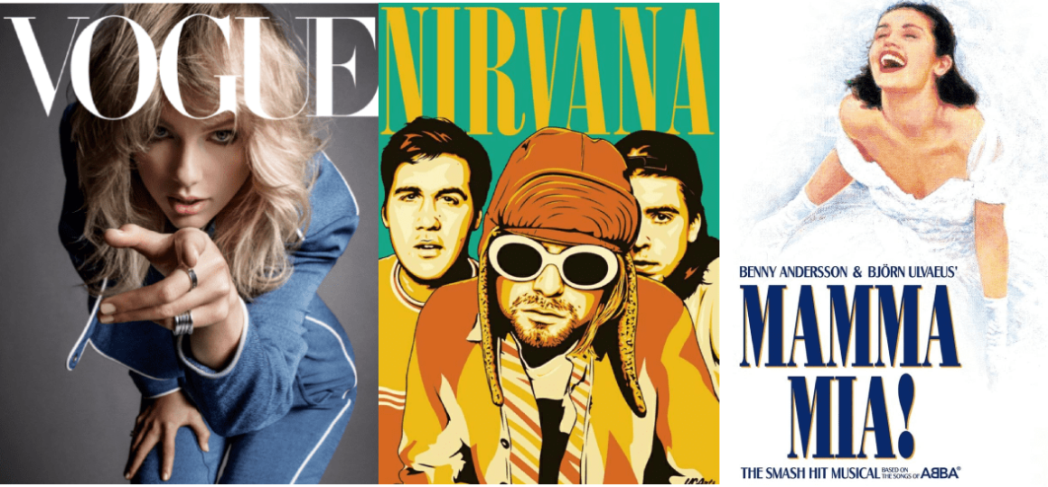
It appeared back in the 18th century thanks to the famous Italian typographer and publisher Giambattista Bodoni. Due to the combination of thick and thin lines, and sharp perpendicular serifs, Bodoni looks contrasting and dramatic. It looks best in large versions, like Vogue’s and Nirvana’s logos, as well as posters for the musical “Mamma Mia!”.
This outline will suit brands that want to communicate their expression, e.g., fashion- or art-related.
37. Ff Mark
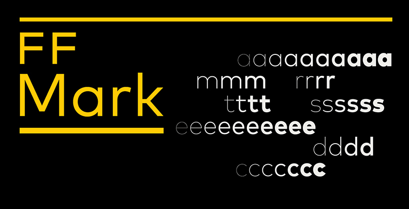
The characters of this font have an advanced approach to usage. It is considered by the designers while opting to make a stylish touch for headings on the movie. MasterCard is another business that has made its logo design by using this font.
What do you think about these Super famous brand fonts?
Don’t miss these posts too:
– 26 Free Minimal Fonts by Designers for Designers
– 20 Best 2022 Free Calligraphy Fonts
– 40 Best Free Outline Fonts For 2022
– 30 Bold Fonts for Designer In 2022
– 36 Outstanding Free and Premium Fonts for Your Next Project
