Fonts for poster design: This Post provides guidelines for selecting fonts for poster design, including prioritizing legibility, using a font hierarchy, sticking to a maximum of two to three fonts, considering the audience and message, choosing a font that is available on multiple platforms, and experimenting with different fonts and styles. The font you choose can greatly impact the overall aesthetic and readability of your design, so it’s important to choose wisely.
When designing a poster, selecting the right font can greatly impact the overall aesthetic and readability of the design. A well-chosen font can make your poster stand out and effectively communicate your message. In this blog post, we will provide guidelines to follow when choosing fonts for your poster.
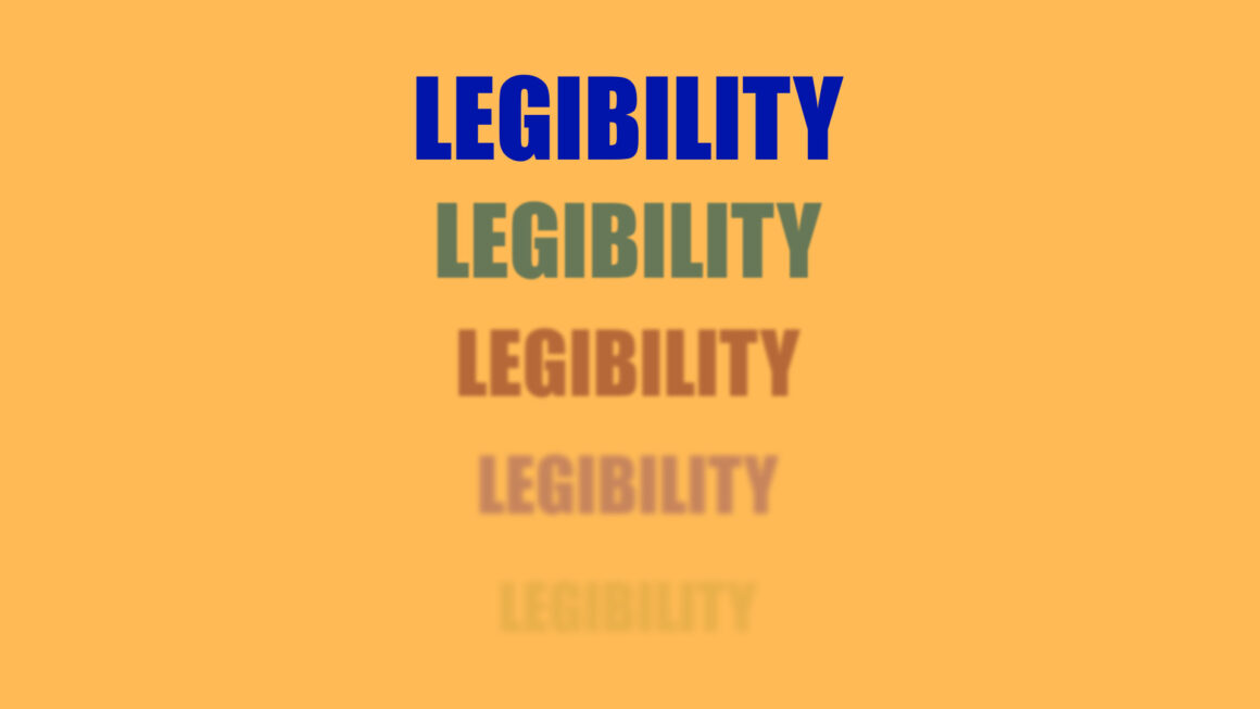
Legibility is Key
The font you choose should be easily readable from a distance. In most cases, posters are posted in public places so people can see them from a distance. Avoid overly decorative or cursive fonts that are difficult to decipher. Instead, choose a crisp, bold font with good contrast between the lettering and the background. Readability is important, especially if you want to grab the attention of people passing by your poster.
Use a Font Hierarchy
Using different font sizes and weights, you can create visual hierarchy in your poster. This will help direct the reader’s attention and draw attention to the most important information. For example, you can use a larger, bolder font for headings and a smaller, lighter font for body text. Therefore, the reader’s attention is first directed to the most important information.
Stick to a Maximum of Two to Three Fonts
Using too many fonts can make your poster look cluttered and unprofessional. Use up to two or three fonts that complement each other and match the overall design aesthetic. For example, you can use one font for headings, another font for body text, and a third font for accents. This allows you to create a consistent and visually appealing design.
Consider the Audience and Message
The font you choose should match the tone and message of your poster as well as the audience you are trying to reach. For example, a playful font might be appropriate for a children’s event, while a more formal font might be appropriate for a business meeting. Think about the mood you want to convey and choose a typeface that supports it. In this way, fonts can help convey the message you want to convey.
Choose a Font that is Available on Multiple Platforms
Make sure the font you select is readily available on multiple platforms to ensure that your poster looks consistent across all devices. If you use a font that is not available on a user’s device, it may be substituted with a default font that can negatively impact your design.
Experiment and Have Fun
Designing a poster is a creative process, so don’t be afraid to experiment with different fonts and styles. Try different combinations of fonts and see how they work together. And most importantly, have fun with it!
Tips for Choosing the Right Font
Here are some tips to help you choose the right font for your poster design:
1. Identify the purpose of your poster
Before you begin designing your poster, identify your main objective. What message do you want to convey? Who is your target audience? What kind of tone do you want to set? Once you have a clear understanding of your objective, you can choose a font that supports it.
2. Choose a font that matches your poster’s theme
The font you choose should match the theme of your poster. For example, if you’re designing a poster for a music festival, you might want to use a font that has a playful or energetic feel. On the other hand, if you’re designing a poster for a business conference, you might want to use a font that is more formal and professional.
3. Use a font that is easy to read
As mentioned earlier, legibility is key when it comes to poster design. Make sure the font you choose is easy to read from a distance. Avoid using fonts that are too small or too intricate.
4. Consider the font’s spacing and kerning
The spacing between letters and words can greatly impact the overall look of your poster. Make sure the font you choose has adequate spacing and kerning, so the letters don’t overlap or touch each other.
5. Test your font on different devices
Before finalizing your font choice, test it on different devices to ensure that it looks consistent across all platforms. This will help you avoid any unwanted surprises when your poster is displayed.
Conclusion
In conclusion, selecting the right fonts for poster design is crucial in making your message stand out. By following these guidelines, you can create a visually appealing and effective poster that conveys your message clearly to your audience. Remember to prioritize legibility, use a font hierarchy, stick to a maximum of two to three fonts, consider your audience and message, choose a font that is available on multiple platforms, and most importantly, have fun with it!
If you’re feeling stuck, there are many resources online that can help you find the perfect font for your poster design. Some popular font resources include Google Fonts, Adobe Fonts, and DaFont. These resources offer a wide variety of fonts that you can browse and filter based on style, popularity, and more.
So go ahead and experiment with different fonts and styles. With these guidelines in mind, you can create a poster that not only looks great but also effectively communicates your message to your audience.
Happy designing!
Check List:
- Choose a font that is easy to read
- Stick to a maximum of two to three fonts
- Consider the audience and message
- Choose a font that is available on multiple platforms
- Test the font’s spacing and kerning
- Experiment with different fonts and styles
If you need font , then check this post out:
- 50+ Free & Bold Fonts for Designer in 2023
- 20+ Free & Best Gothic Fonts 2023
- 26 Free Minimal Fonts By Designers For Designers
- 20 Best 2022 Free Calligraphy Fonts
- 20 Beautiful Fonts for Wedding Invitations
- 20 Best Movie Poster Design Fonts
- 20 Best Fonts for Books
- 20 Best Pirate Fonts (Free & Pro)
- 20 Best 2022 Free Calligraphy Fonts

